Creating a differentiated brand among corporate competitors that puts client relationships at its heart.
Branding, Copywriting, Graphic design, Marketing strategy, Web development
Background and challenge
In an industry that can sometimes feel a bit corporate and impersonal, Perfect Pear was conceived to be the opposite of that. A PR agency focused on building proper relationships, and becoming a true extension of their clients’ teams, the challenge for us was to communicate this difference. Our client was keen to set themselves apart and emphasise ideas of partnership, trust, and reliability.
So, we knew from the outset that this fresh perspective was going to be our driving inspiration, and we set about creating an approachable identity that conveys a positive, engaging, and collaborative client experience, and also one that encourages confidence in the quality of work.
"The Fook team were amazing in developing the branding, guidelines and website for my new business. It was an absolute pleasure working with them and I plan to collaborate with them on future design/creative projects."
Phil B – Founder
Process and solution
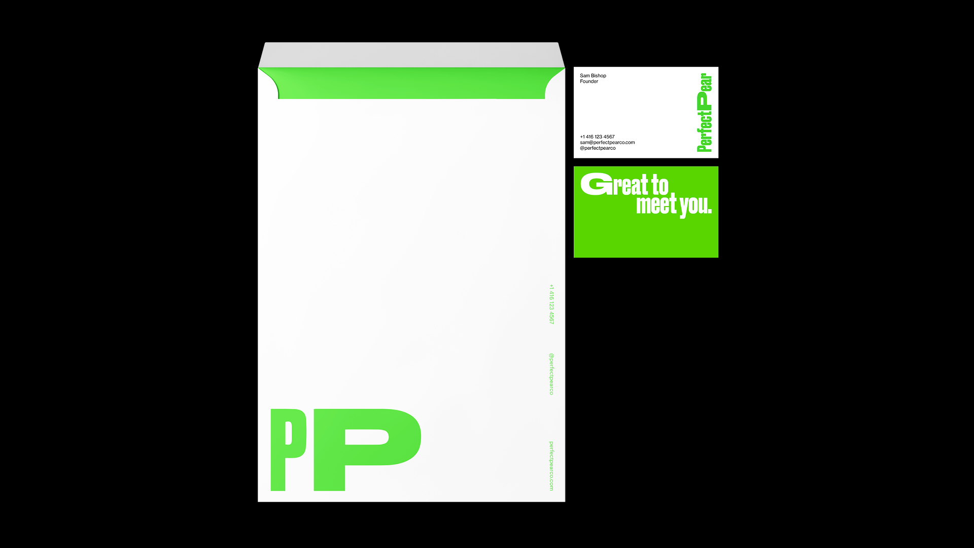
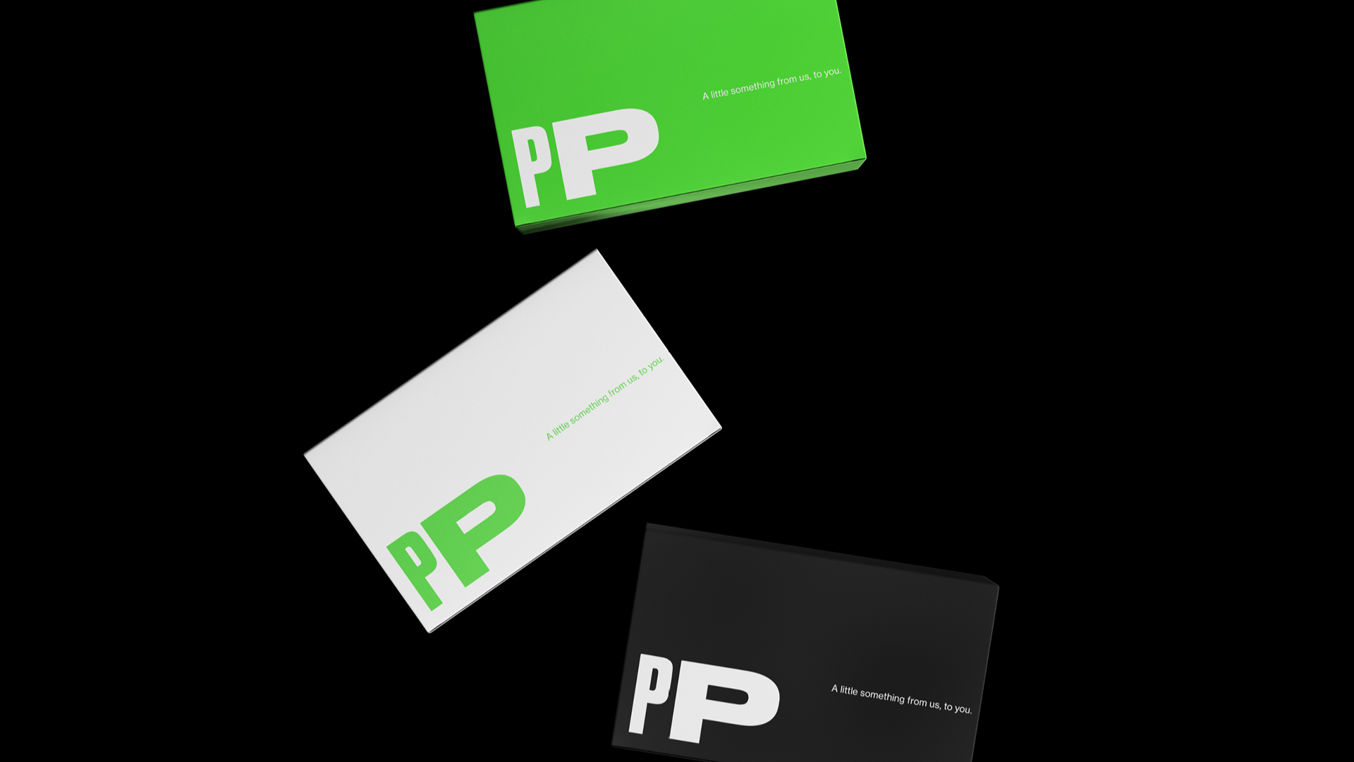
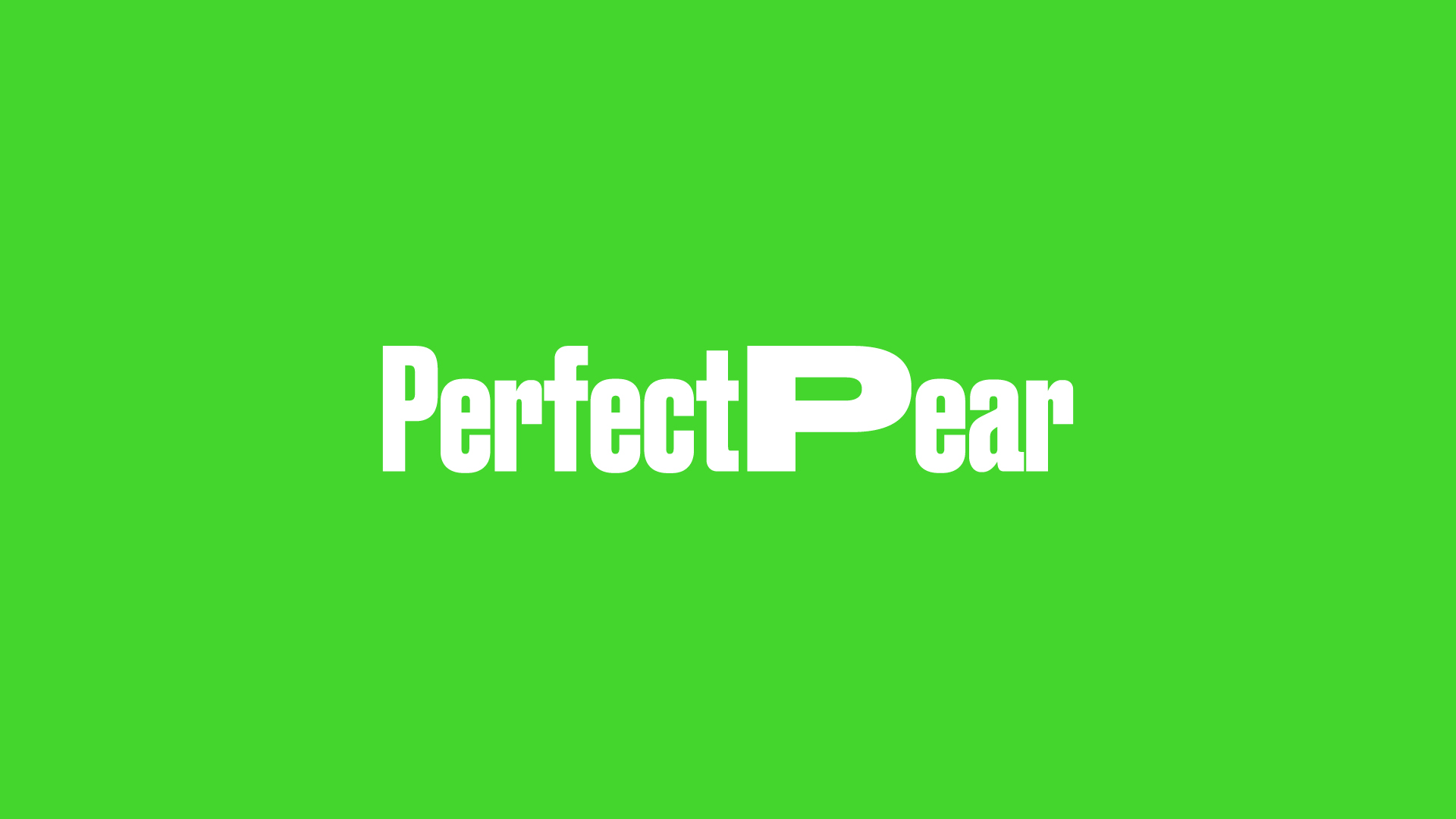
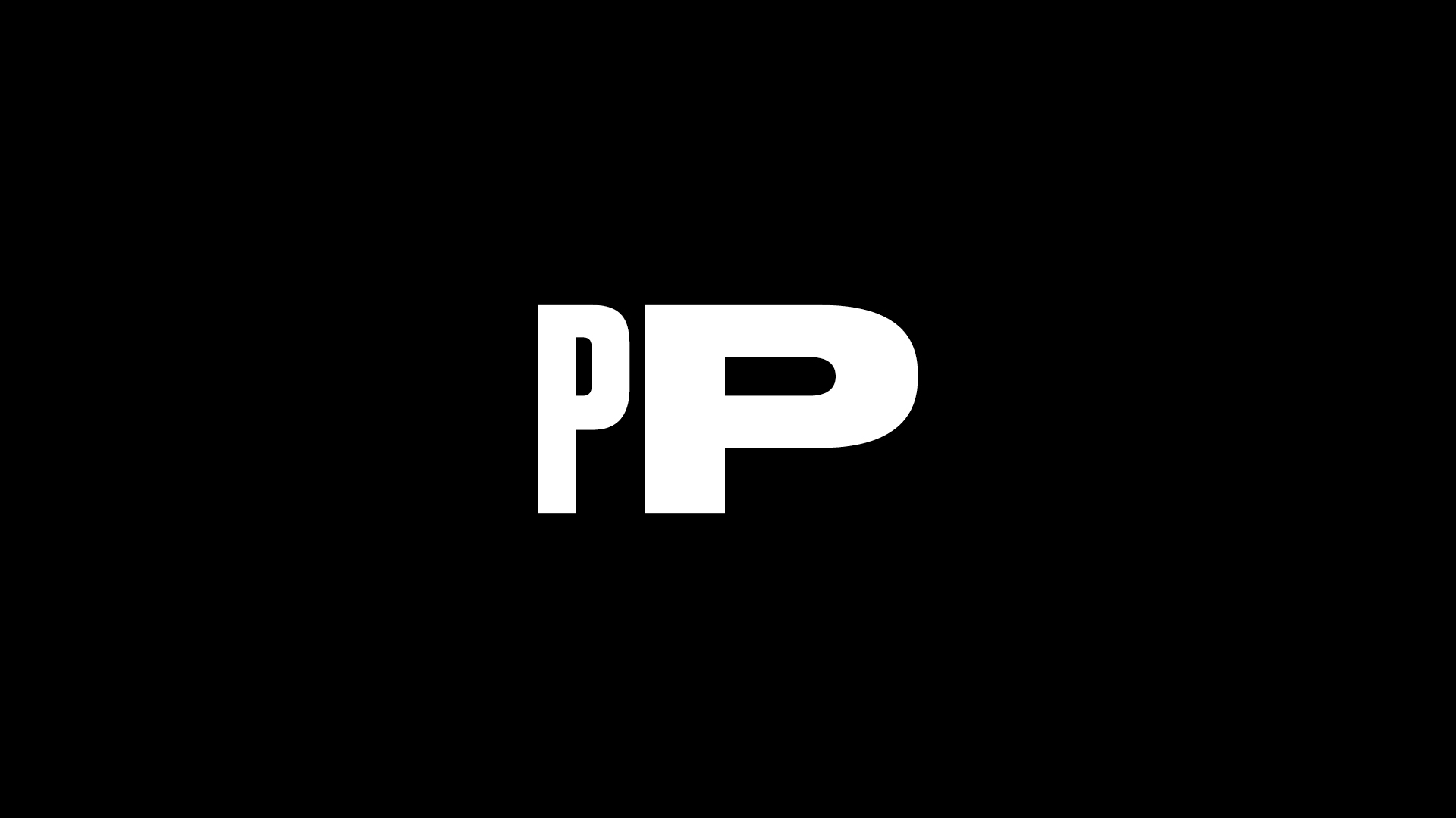
Our brand identity started with a logo that represented this idea of a partnership. In the main feature of the logo, the 2 ‘Ps’, we stretched one of these letters (using the Wide weight of the Druk typeface). When brought together into “PP”, we wanted this to reflect the idea of client and provider coming together – 2 different, yet similar, parts of the equation, united in a singular vision.
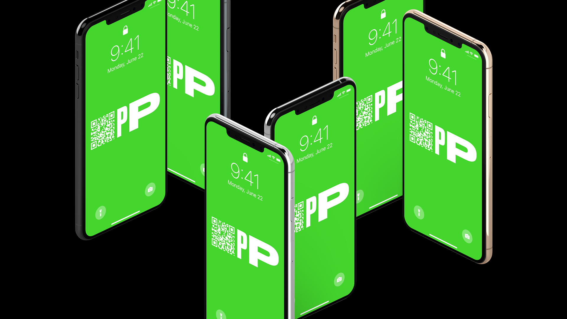
This widened feature of the typeface is maintained throughout the marketing materials of the brand, and gave us a great tool to apply that unique and fresh touch, and to introduce playfulness into the brand voice.
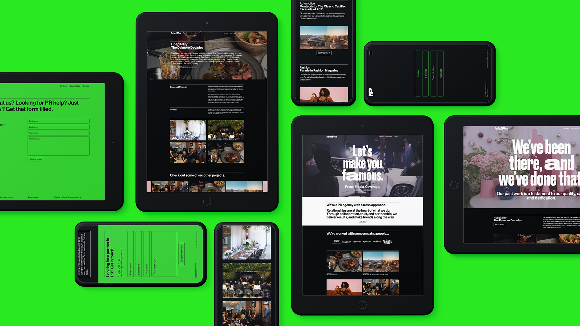
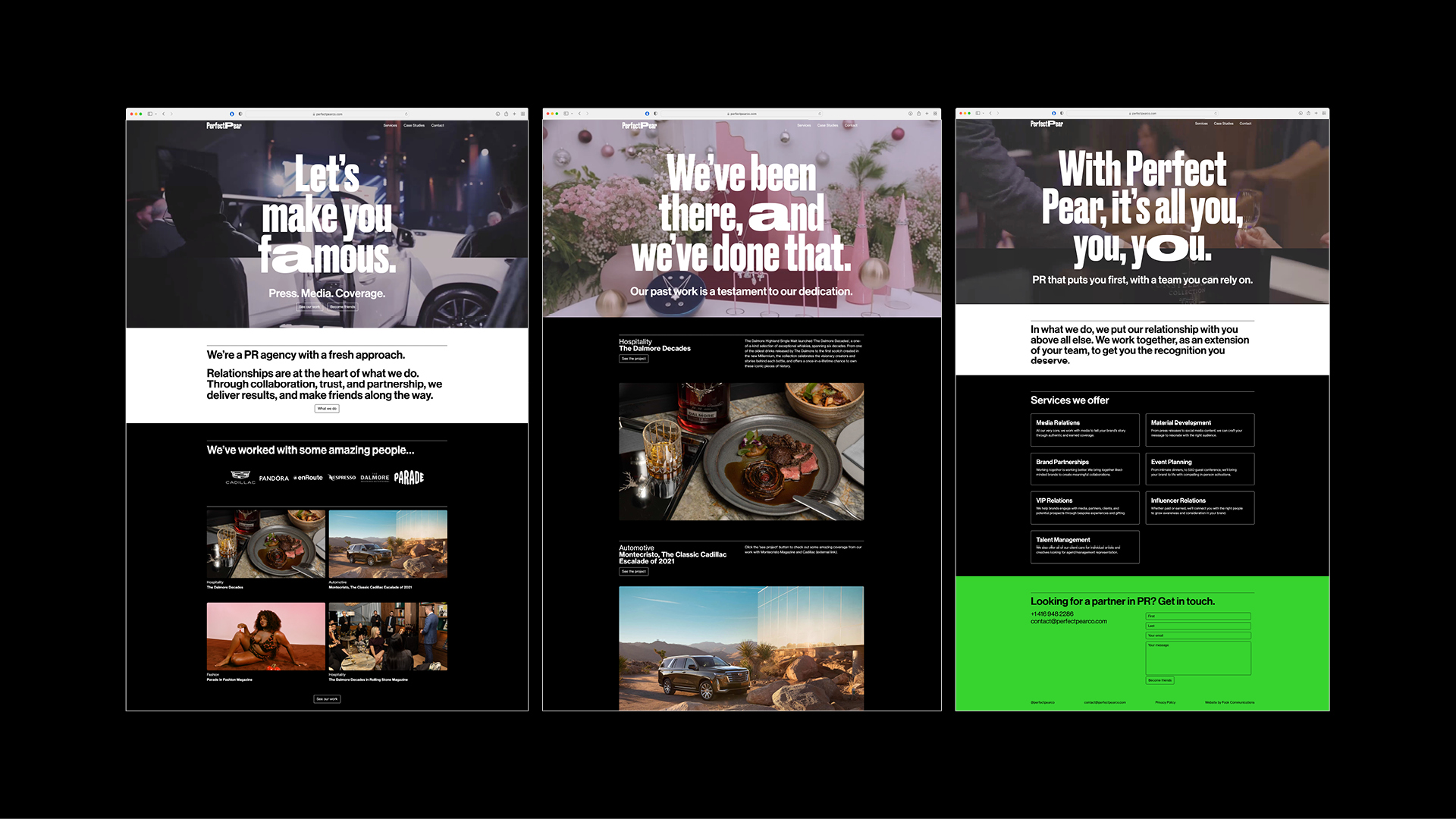
The most important place for us to bring the new Perfect Pear branding to life was on their website. Taking the visual identity we had created, it was important that the website felt like something new in the PR industry – a completely fresh voice in the field.
With a vibrant colour palette carefully balanced throughout the site, we wanted to use this energy to help attract a like-minded clientele who were looking for an innovative and forward-thinking partner.
The energy of these colours, and the boldness and playfulness of the Druk typeface, were also the perfect supporting cast for the brand voice we wanted to establish – one that was confident, but also accessible and conversational.
Result
Through our work, the resulting identity breaks free from the corporate shackles of its industry, and the often cold and impersonal companies within it. Perfect Pear has a brand you can trust and relate to. We balanced being light-hearted with being professional, to ensure we never detracted from the seriousness of the actual work itself. And by being human, and occasionally tongue-in-cheek, Perfect Pear is confident but never arrogant.
As you navigate the website, this feeling that the brand is having a conversation with you is the ideal way to put partnerships and relationships at the heart of everything. We continued this approach in the print materials, including gift packages and thank you cards, giving us a consistent client experience from start to finish that always seeks to build a rapport.
By being consistent in our focus on what makes Perfect Pear different, we established a brand experience that stands out in its industry, and authentically reinforces the Perfect Pear brand values of partnership, trust, and reliability.