A reshaped brand identity that effortlessly evokes luxury, sophistication, inclusivity, and warmth.
Branding, Graphic design
Background and challenge
As one of the oldest and most established fashion retailers in Toronto, the George C name is renowned in the industry, and founded on the philosophy of coveting design over brand.
With such a prestigious reputation, and a brand built around the quality of their offering, a lot was riding on getting everything right in the new brand identity. We had to deliver a contemporary and distinct identity for them to continue to grow in a crowded fashion space, without losing any of their association with luxury, quality, and sophistication.
So, this was an identity that needed to appeal to new audiences, while maintaining the connection their loyal customer base already felt for the business.
Process and solution
Protecting a brand’s legacy while helping to secure its future is a fine balance, and getting it right needs a comprehensive creative process. This all starts with understanding everything about the business, its values, and what’s important to their audience.
Distinguished by their careful curation and meticulous personal styling, their brand had to possess these same levels of consideration and thought. It also needed to boldly assert them as an authority on luxury fashion, while remaining invitational and accessible. George C are committed to a warm and welcoming shopping experience, and so the luxury connotations in their identity could not displace the deeply human side of their brand.
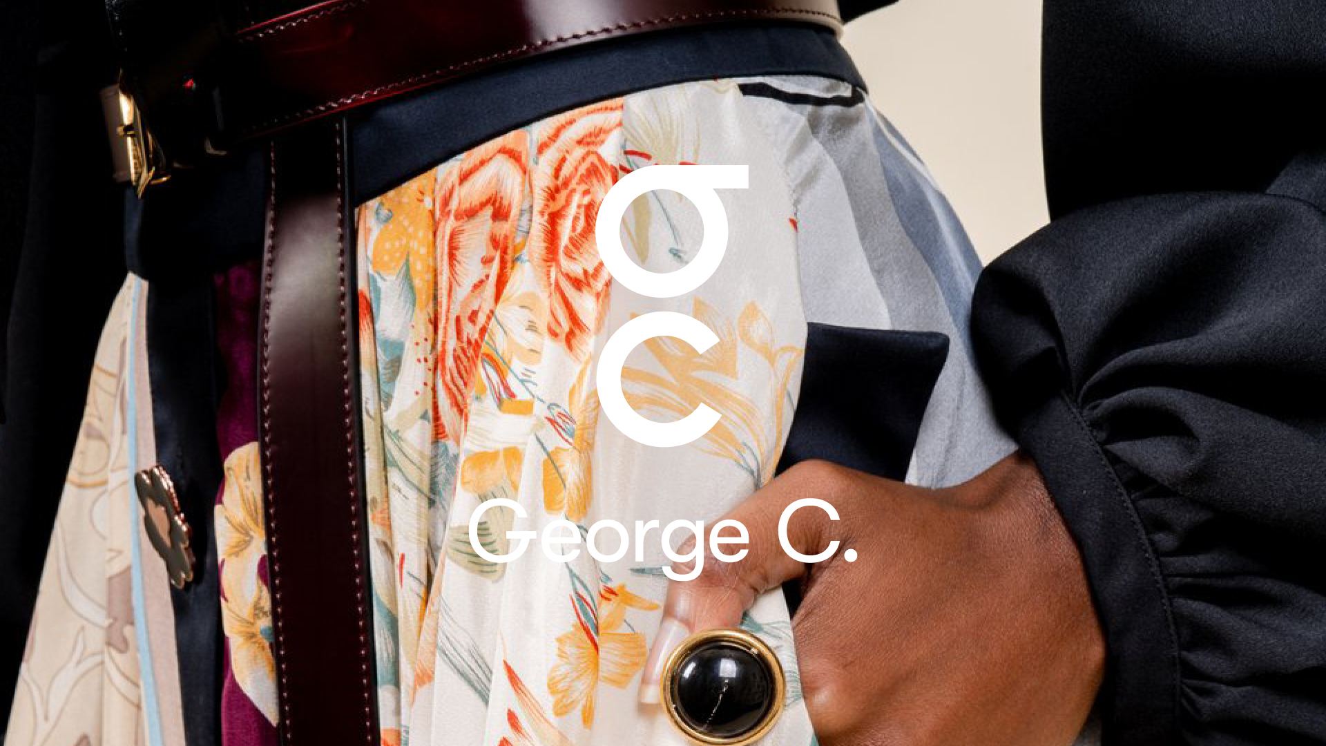
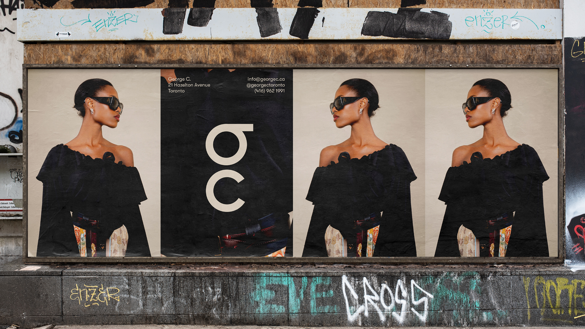
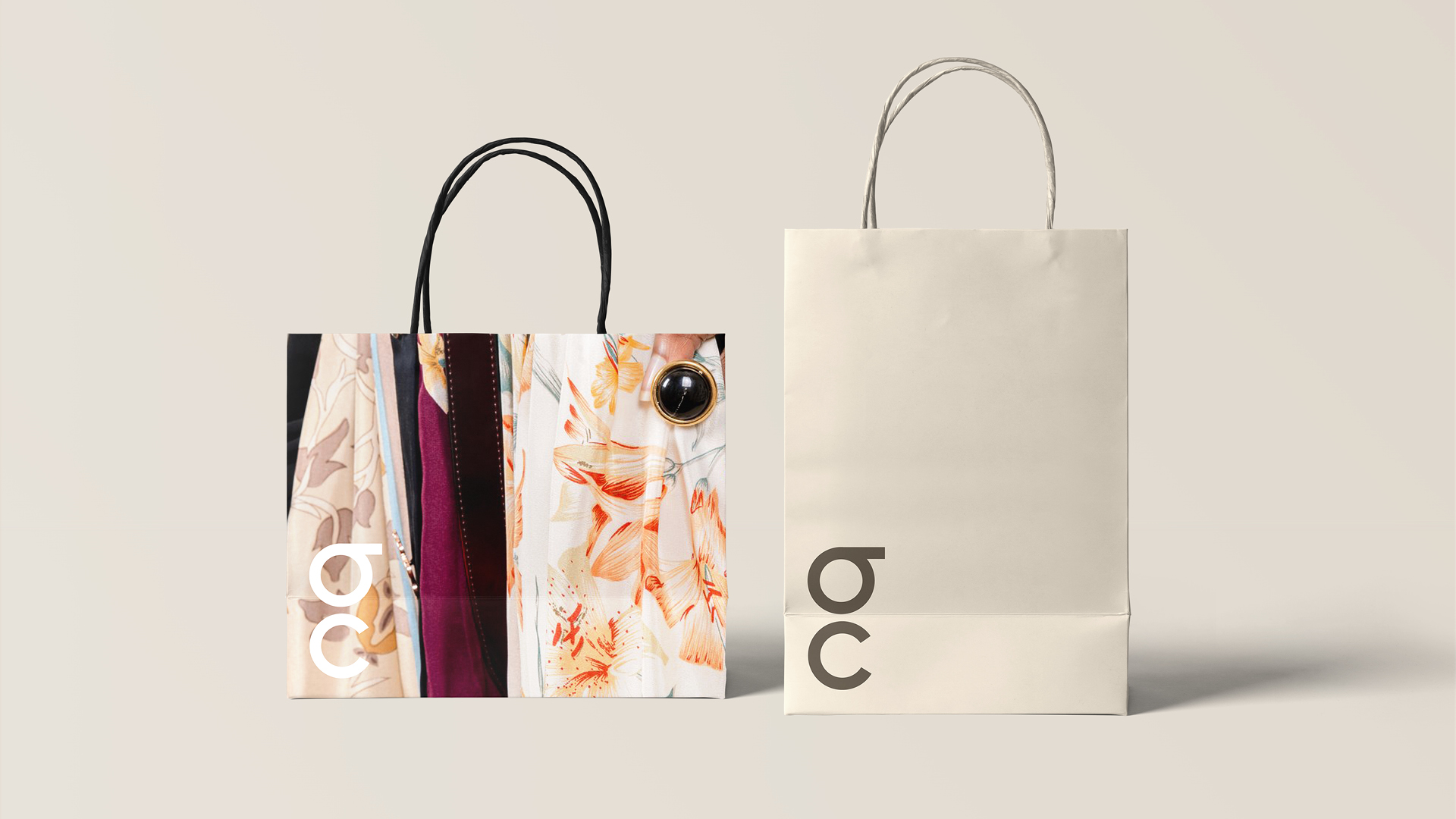
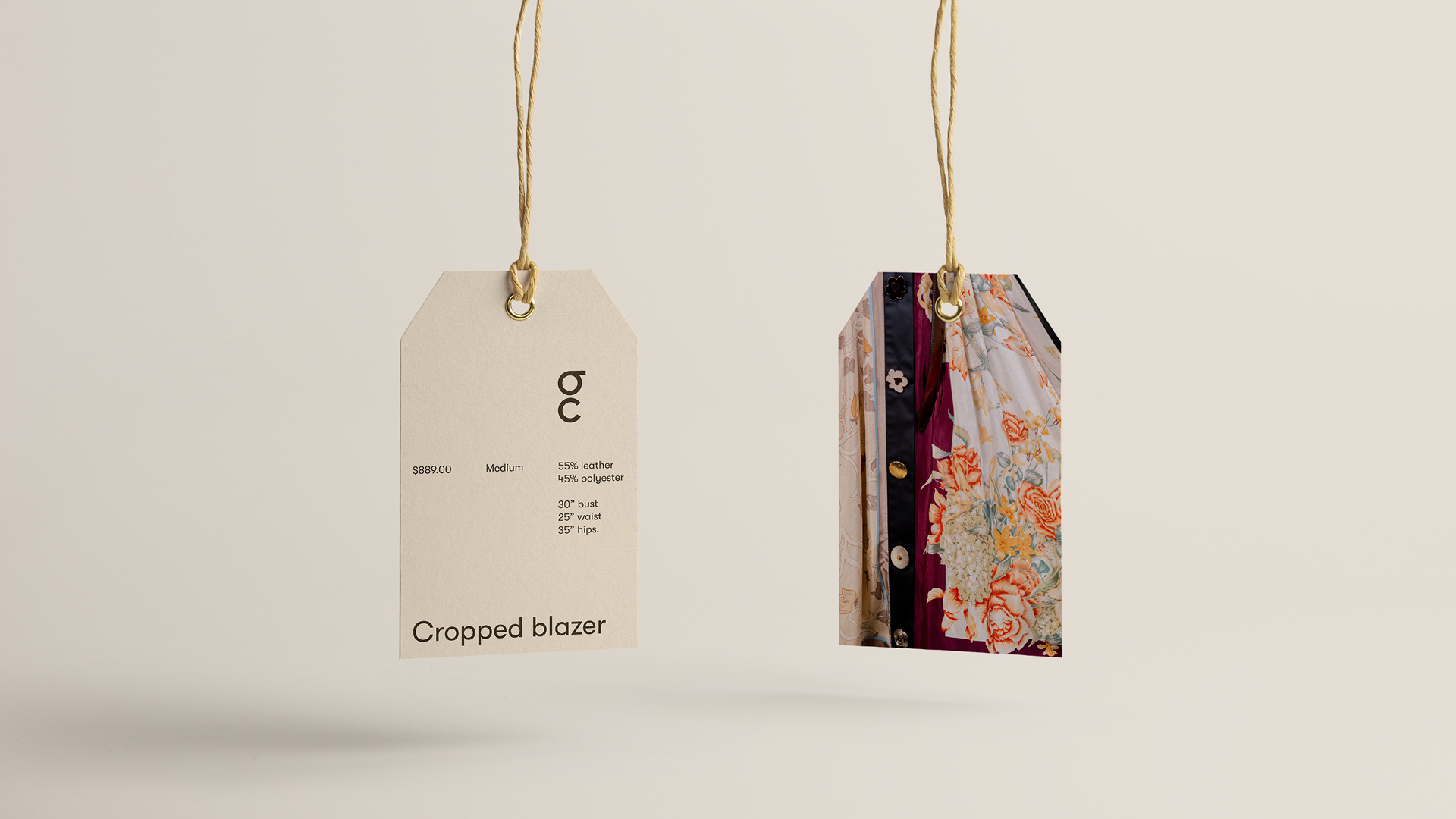
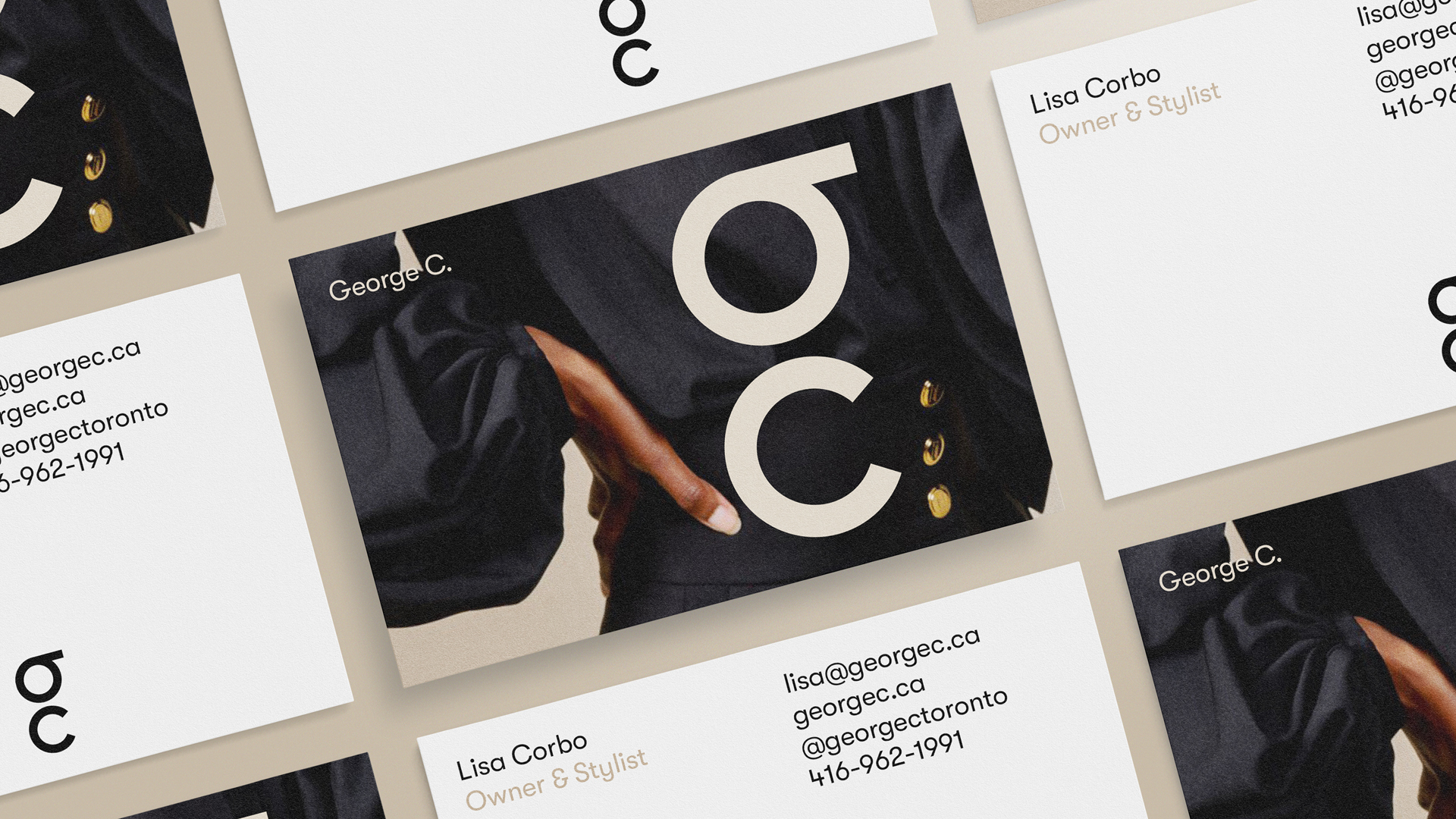
When creating the logo, we recognised that, as a company that has pioneered the Toronto fashion scene, the logo needed to do no more than represent their name. By doing this through a simple condensing of the name into a singular lettermark, the brand effortlessly carries itself with confidence and renown. It achieves a genuine sense of luxury by standing with clarity and meaning.
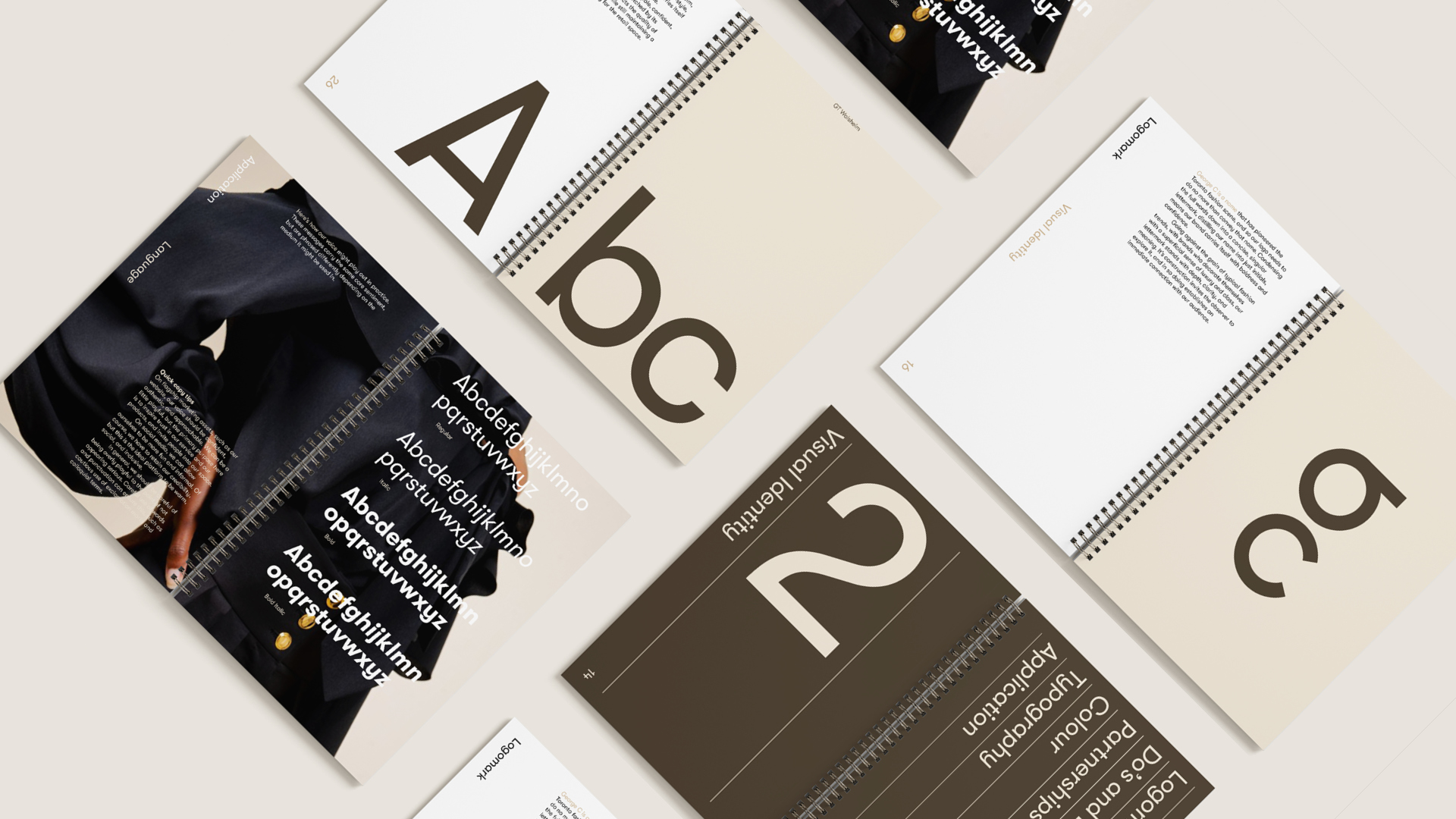
In the colours, there are three shades of brown in the palette. They instill a sense of calmness and tactility, while also referencing leather, a staple material in the George C collection. In this way, the colours carry inherent implications of quality and luxury. Likewise, we wanted the same implications in the brand’s typeface. Our ultimate choice, GT Walsheim, is friendly, legible, confident, and precise. Its simplicity is matched by its sophistication, reflecting the high calibre of George C products while maintaining approachability.
Result
And so, at each stage of crafting this new identity, the philosophy and the experience associated with George C were constantly considered. The result of this work and these considerations is a brand that presents George C with the distinction that their reputation demands. It has also given them a new look that their clients love, and their beautiful new e-commerce store is making many new customers fall in love with them.