Building a nuanced, meaningful, and culturally aware brand to make a necessary contribution to society.
Branding, Copywriting, Graphic design, Marketing strategy, Videography, Web development
Background and challenge
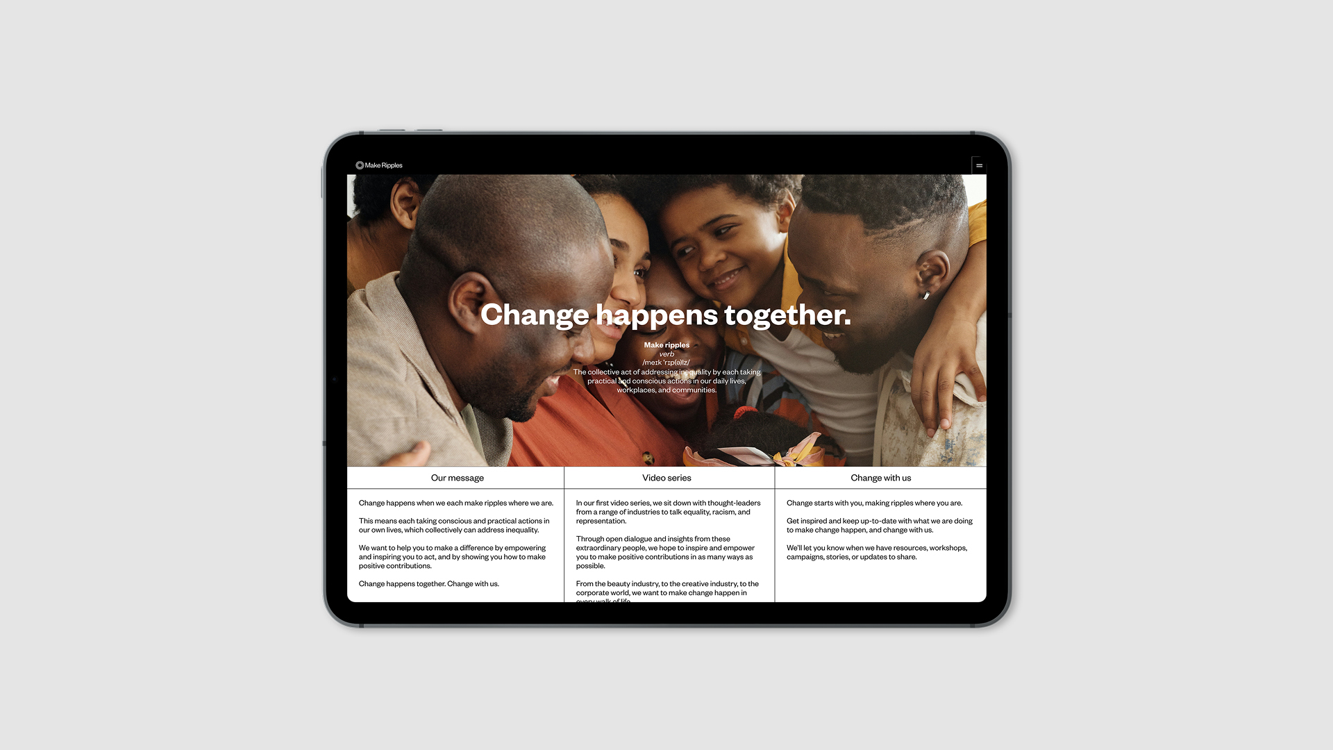
Make Ripples is an anti-racism not-for-profit founded on the idea that change happens when we each take practical and conscious action in our daily lives, communities, and workplaces – when we “make ripples where we are”. It exists to make change sustainable by addressing inequality through education and knowledge sharing.
We helped to start this organisation, alongside an incredible founding team, by creating all of the branding and marketing materials – from the brand identity, to the website, to internal pitch materials.
From the outset, the team made clear to us that the goal for this non-profit was to feel accessible and valuable. It needed to make measured, thoughtful contributions to important conversations, and empower, inspire, and motivate people to continue taking action in whichever ways they can to make change lasting.
"I didn't know that the brand Fook made was exactly what I wanted to see. Bravo - it is stellar. Thank you!"
Sasha L – Co-Founder
Process and solution
We spent a lot of time with the founding team in the early stages, getting a deep understanding of their experiences and their aspirations for this organisation.
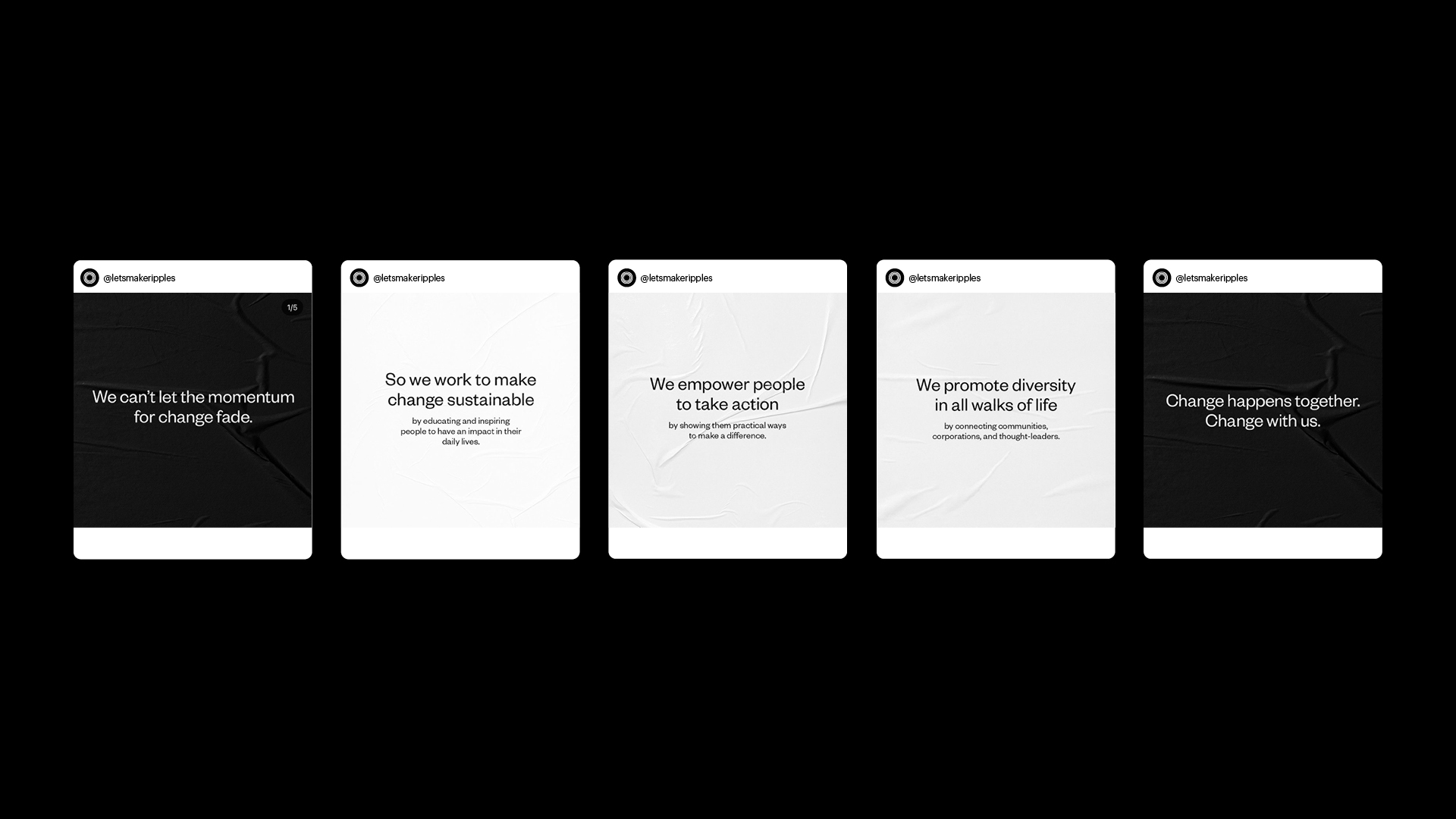
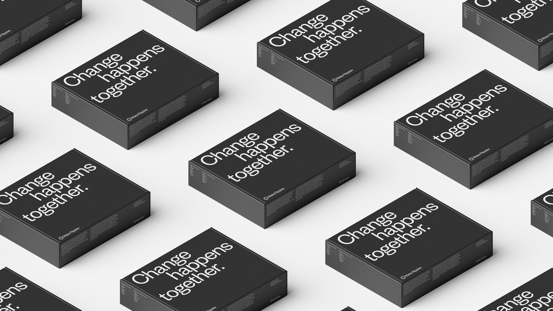
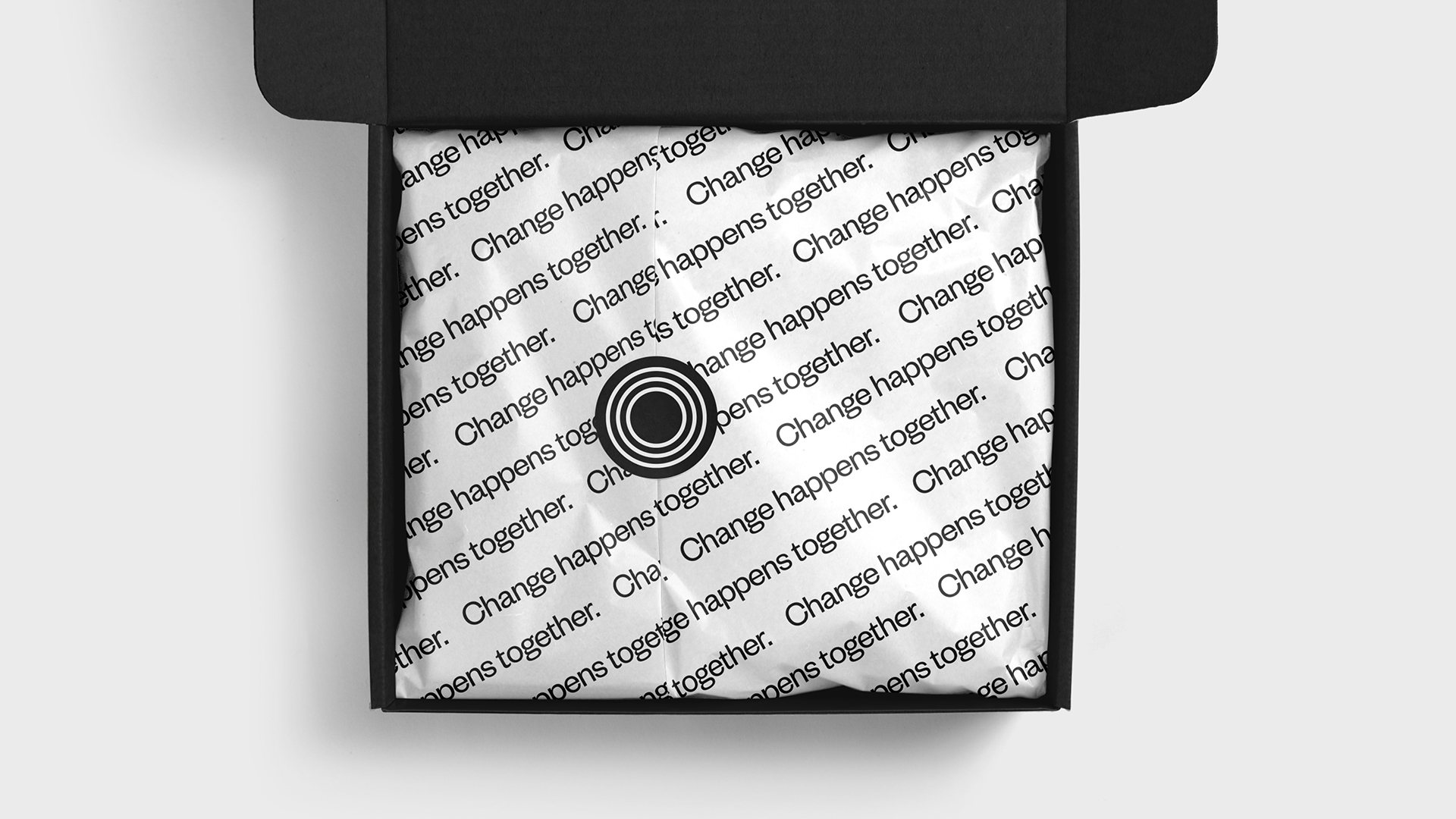
Through hours of learning and conversation, we shaped a vision, value proposition, voice, and core message centred around the idea that “change happens together” – a powerful and succinct distillation of the Make Ripples mission.
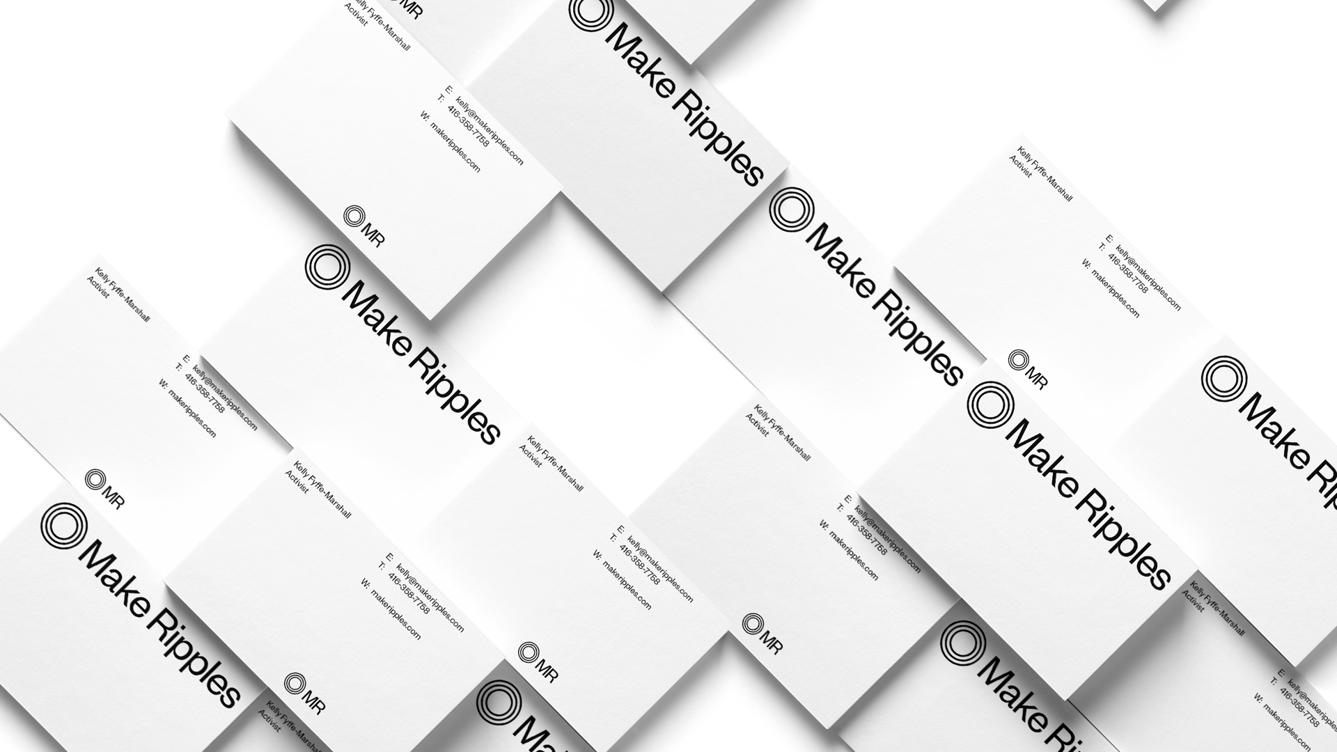
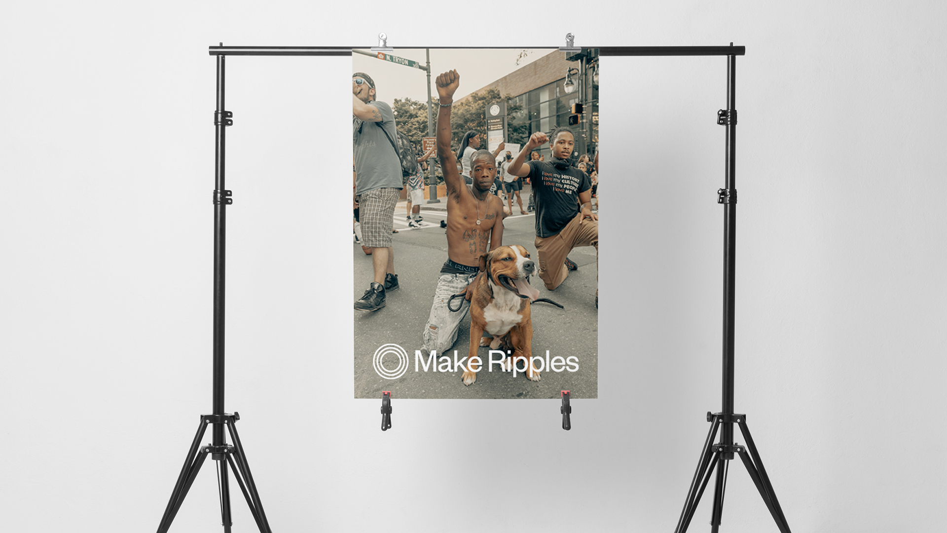
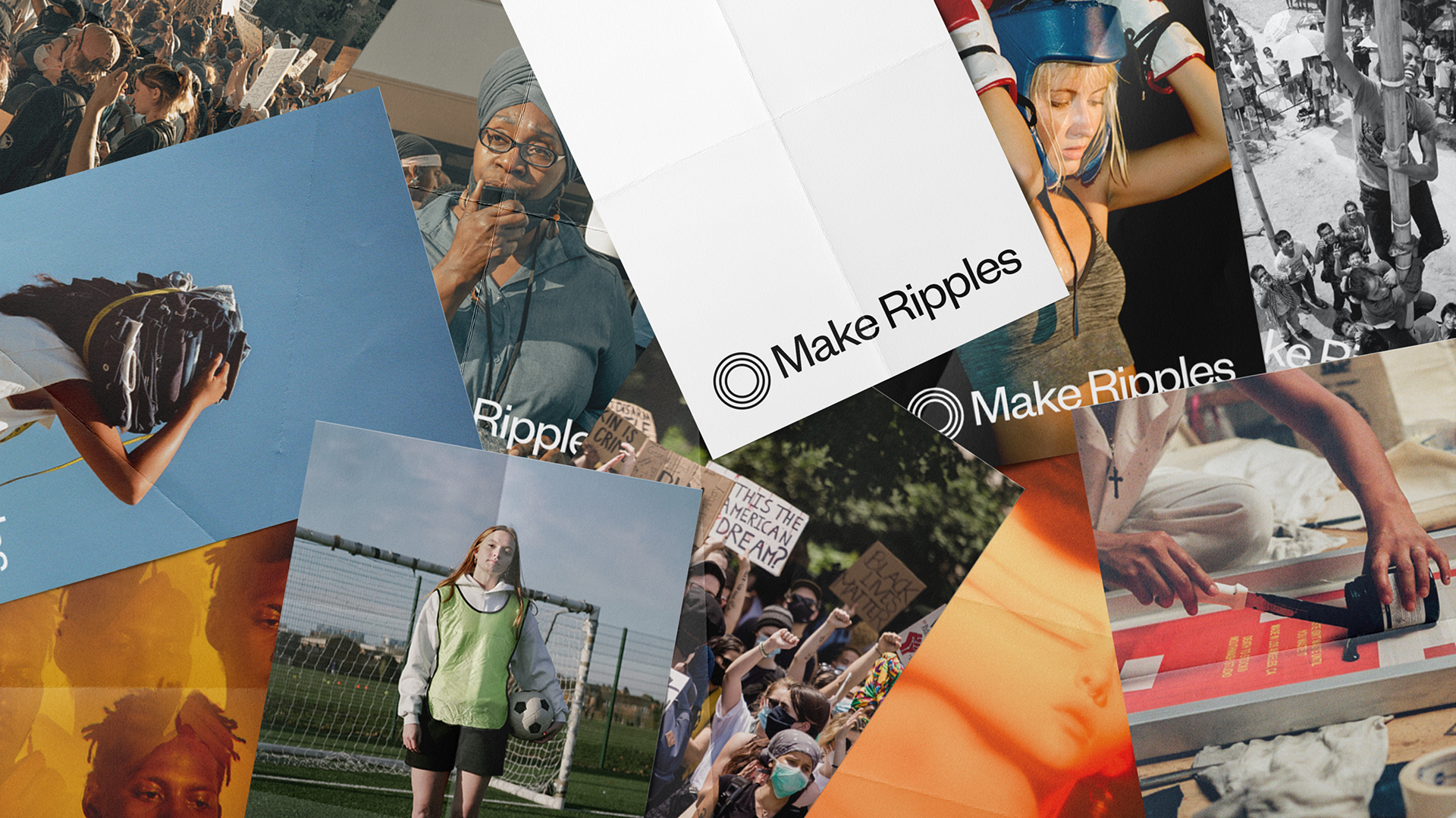
The visual identity was then created to support and amplify the organisation’s purpose. Starting with the logo, we designed a simple representation of this central idea of making changes that reach farther than their initial impact. By avoiding visual complexity, we ensured approachability and clarity in the logo. The use of complete circles also implies the idea of the momentum for change being continuous.
The primary colours, black and white, are intentionally stark and simple. Wanting to help spread valuable and empowering messages, it is the words that come from Make Ripples that take precedence over colour and decoration.
The brand typefaces continue these themes, and also help to carry our intended brand voice. Founders Grotesk, the primary typeface, was first conceived with the goal of portraying information in a serious yet daring tone. This helps Make Ripples speak directly and with authority on matters of race and equality, while also keeping the communication accessible.
The secondary typeface is Times New Roman. Created at the beginning of the modern era of printing, it was made to portray a sense of trust, which is exactly why we used it here. It helps to build a human relationship with the Make Ripples audience, adding approachability and trustworthiness.
Result
By carefully researching and understanding the nuances, needs, and sensitivities around this area, we were able to craft a meaningful identity and message that resonated with its audience, and invited people into its conversation.
The brand speaks to its core purpose, reflecting the ethos of “making ripples”, and also invites people in. With the idea that change happens together, we equipped Make Ripples with a non-confrontational, non-judgemental, human, and accessible brand identity that is equally capable of having the power to speak directly when necessary. Both visually and in the language we use, this is a brand that doesn’t shout or antagonise, but speaks calmly and plainly about the need for action.
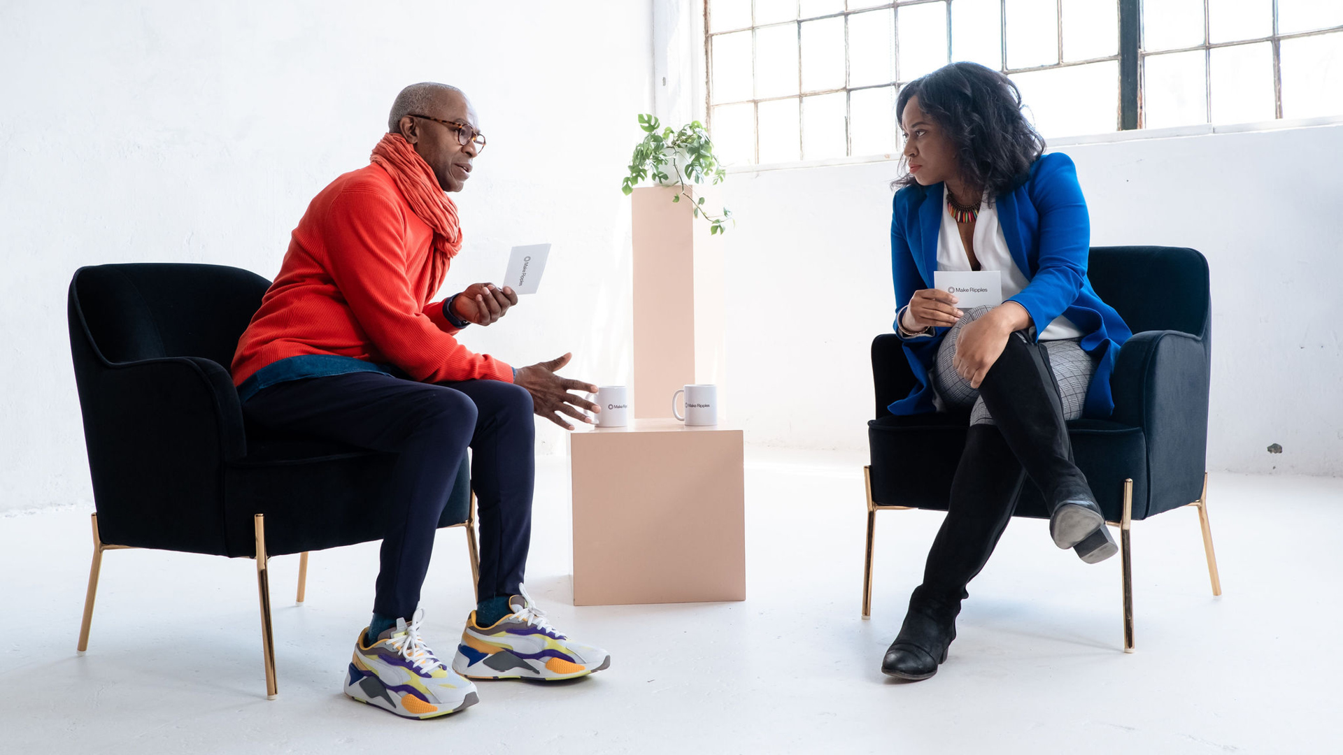
Through this thoughtful and holistic approach to branding an organisation that operates in such a critical part of life, we have created a contemporary brand identity and brand voice for a modern form of advocacy. Enabled by the meticulous work done at the brand level, Make Ripples has since engaged with thought-leaders, incredible organisations, and global brands to spread the Make Ripples message.