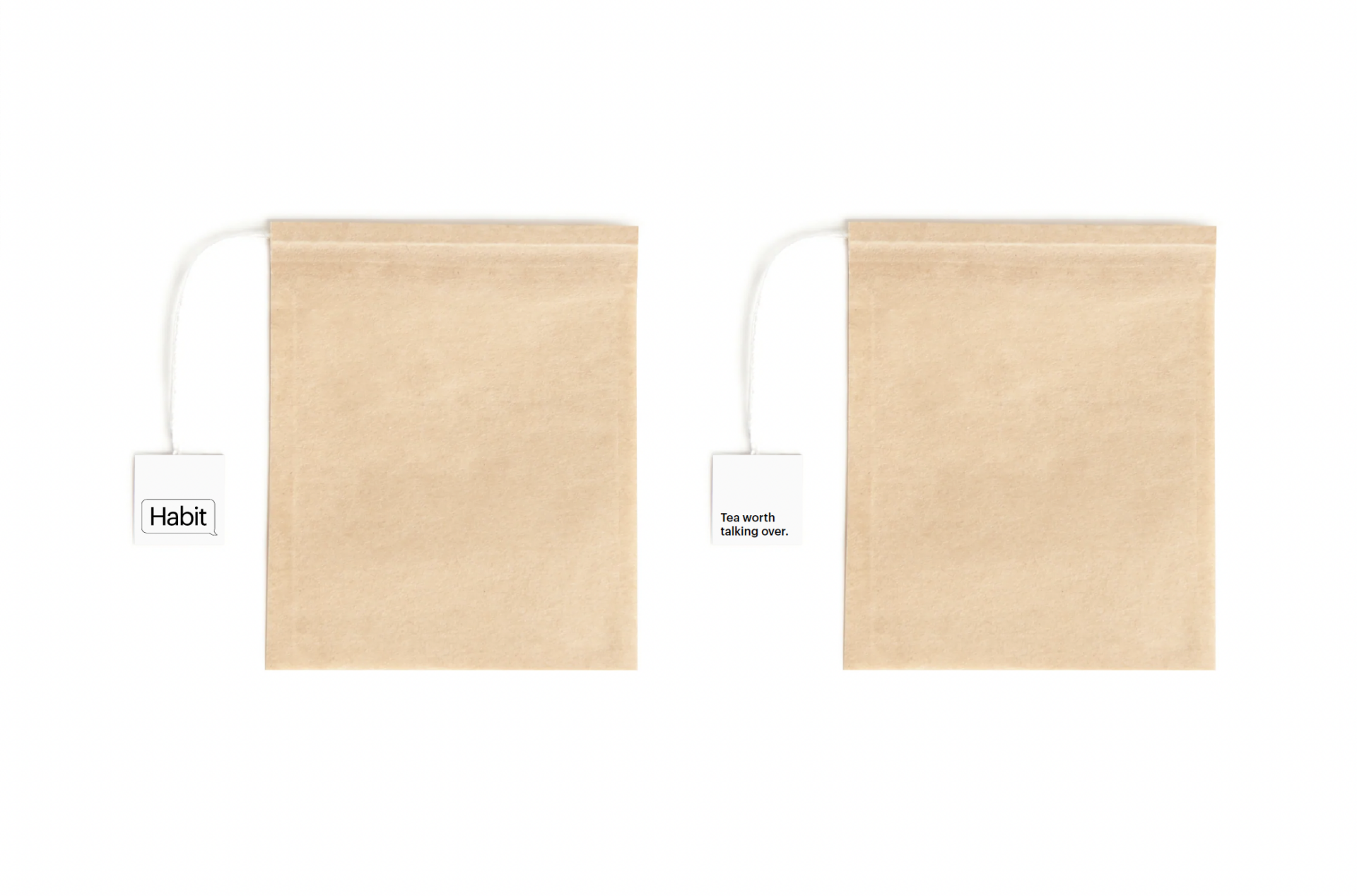
A brand built around connection and conversation, Habit is so much more than a tea company.
Branding, Copywriting, Graphic design, Marketing strategy, Photography
Background and challenge
The team at Habit came to us with a clear goal: creating a tea company to bring people together. Inspired by the ability of tea to enable conversation, our challenge was to build a truly authentic and meaningful brand that was about much more than a drink.
And as a company with founders who have an online community of nearly 2m followers, the stakes were high. This tea brand had to be ready to be launched to a wide global audience.
Through our initial research and strategising, we found a great opportunity to forge a path no other tea brand had followed. This is an industry that often has very similar messaging and talking points. It’s always about the quality of the tea and where the tea came from.
Of course, these are important things, but we couldn’t find a brand centred around something more than just the tea itself. So, we’d create one.
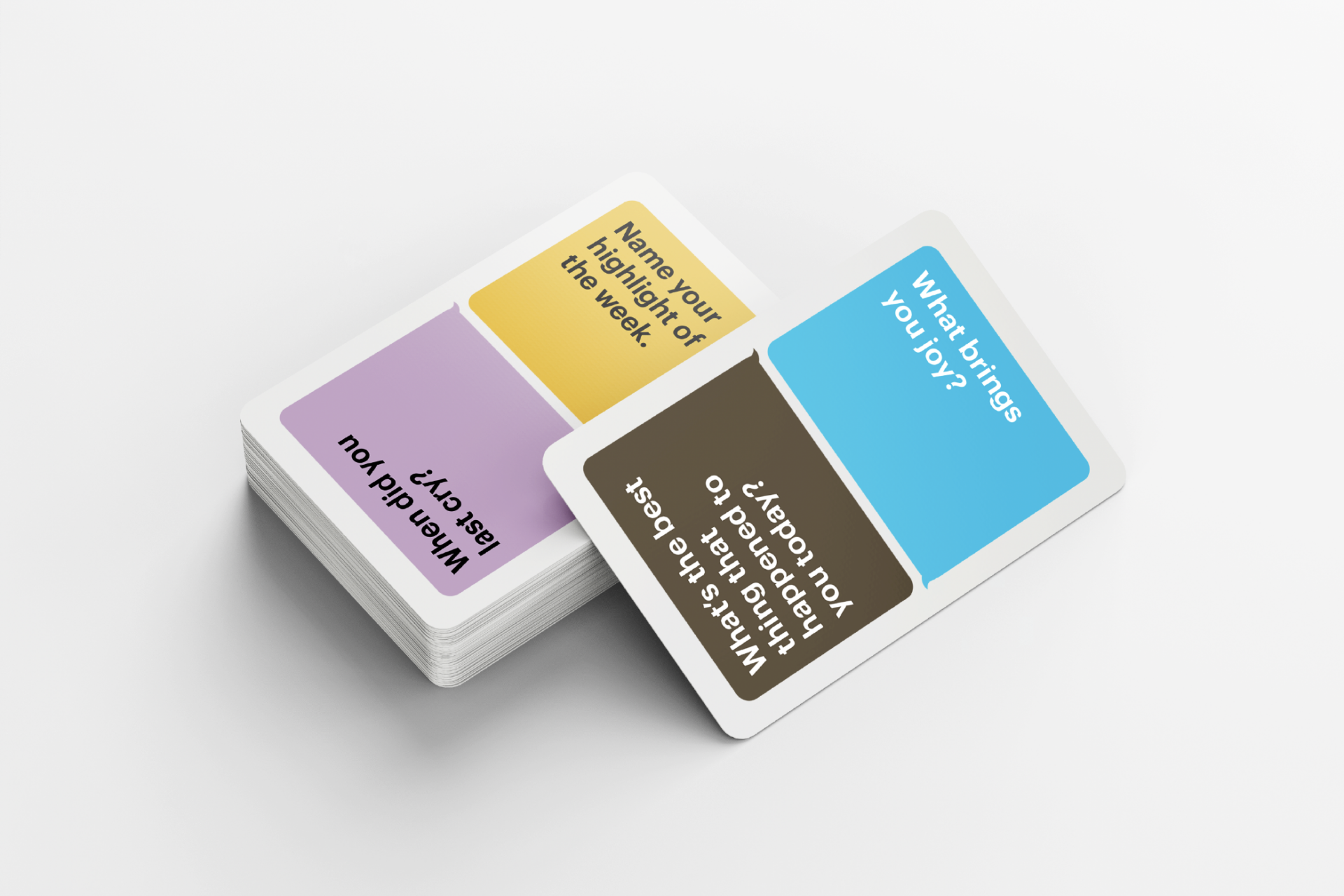
Habit, from the very start, was about fostering connection and proper conversation. It was about the power of tea, beyond its benefits as a drink. It was about building a brand that stood for something and could have a community around it.
Process and solution
The important first step was for us to listen and learn. We deep-dived into the target audience, understanding their demographics, scouring the social media spaces they frequented, and creating a clear picture of who they are.
Understanding the audience, as always, meant we understood what matters to them (and therefore, how to talk to them). And so with this picture we constructed a clear value proposition. We defined our core claims, USP, messaging hierarchy, brand values, and brand voice.
From these foundations, we then created 2 thoughtful branding concepts before deciding on the one you see now (and which actually moved our client to tears!). “Tea worth talking over” is our tagline, with a contemporary and original visual identity for a new generation of tea lovers. Everything in this identity, from the colours to the brand voice, was authentically built around connection and bringing people together.
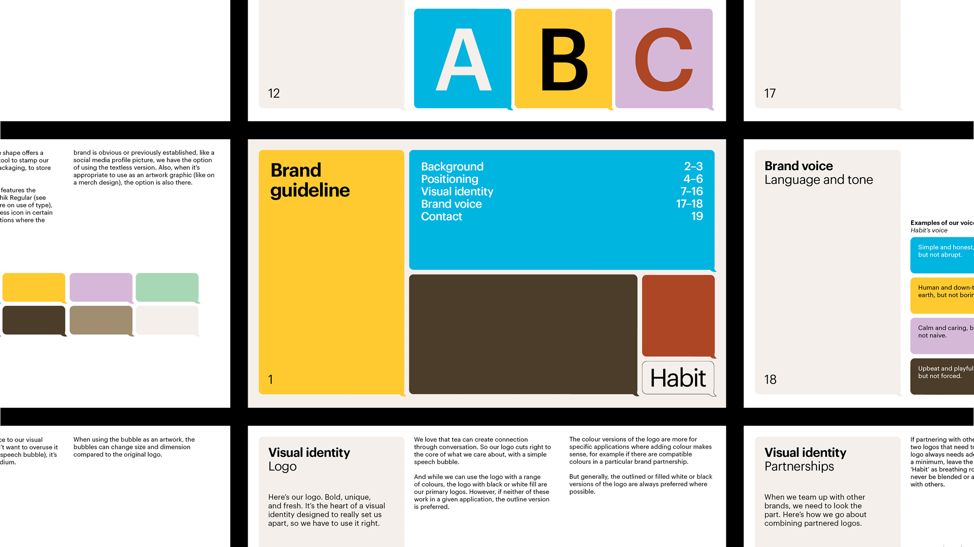
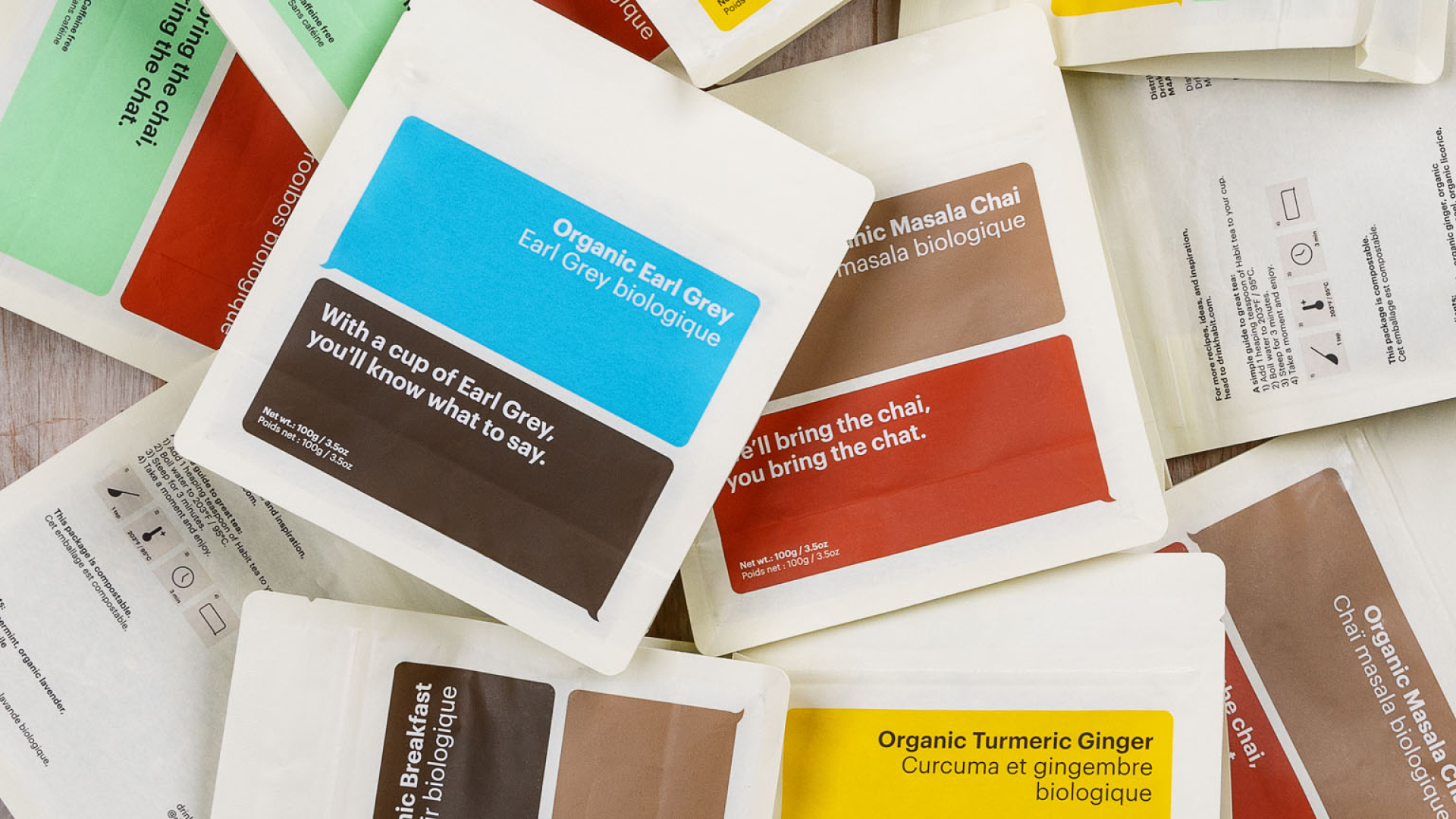
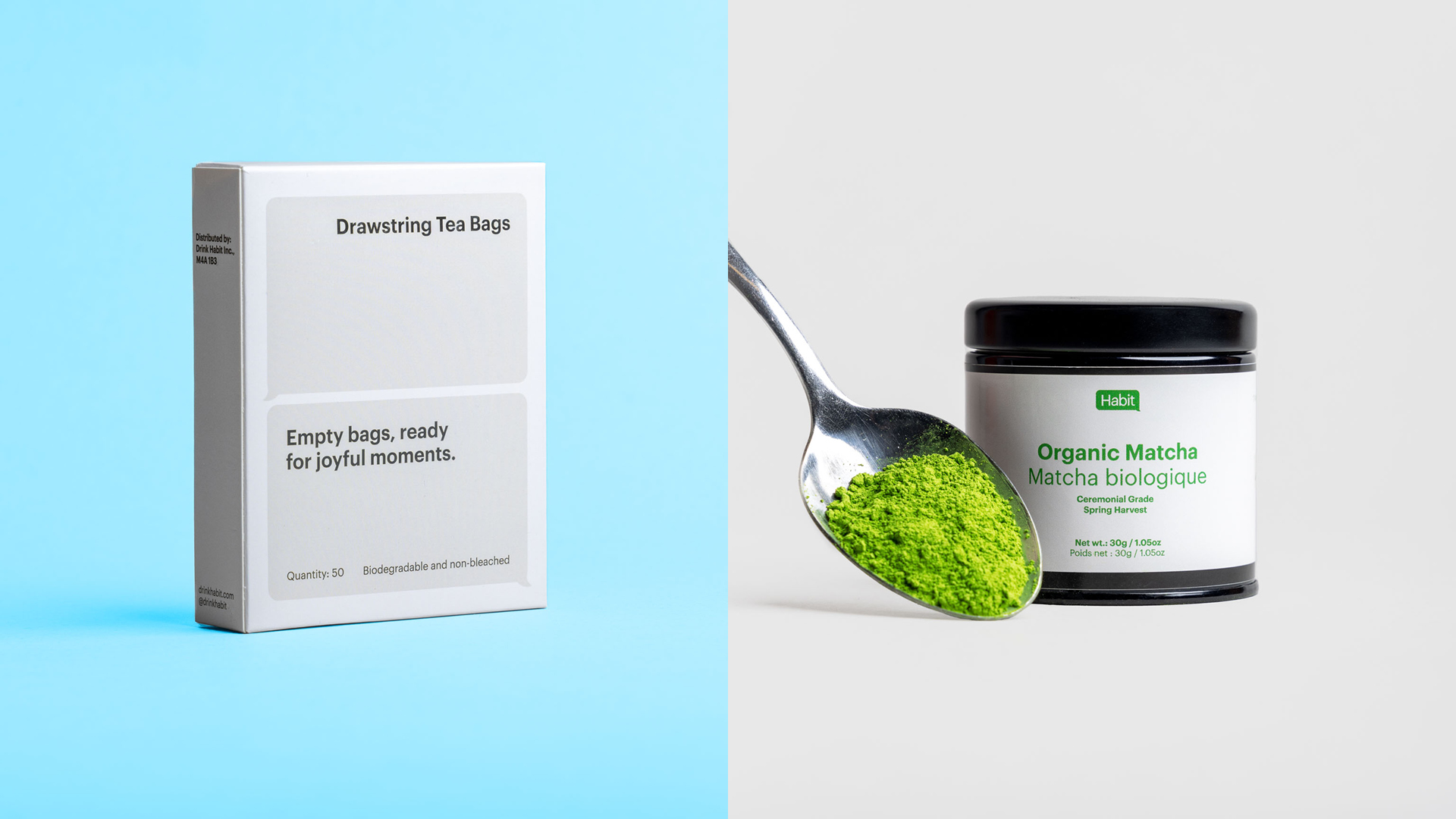
We designed a logo that is immediately recognisable, and a simple distillation of the idea of conversation, combined with a typeface that is accessible and informal.
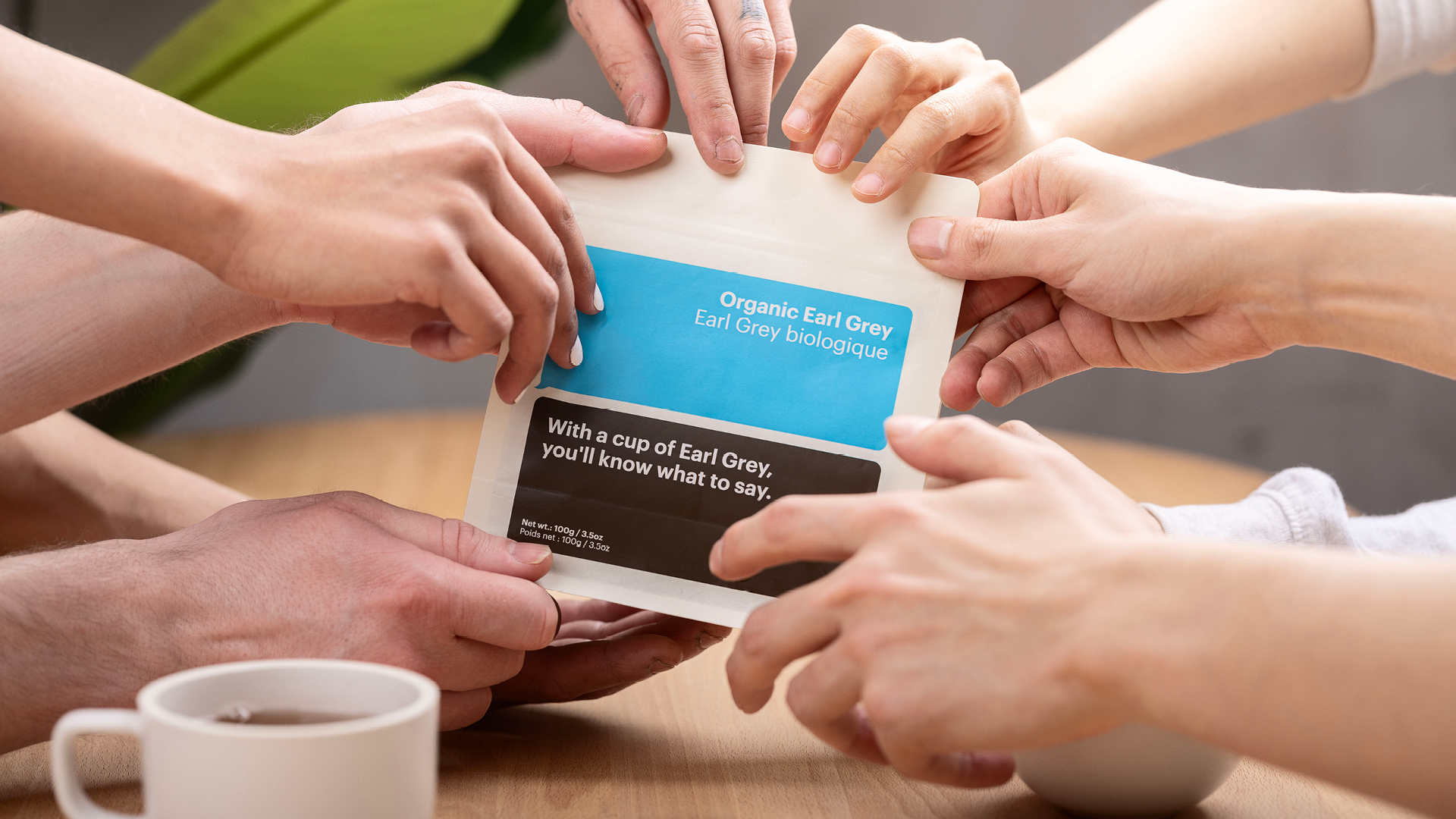
Our colour palette, inspired by the ingredients found in each Habit tea blend, was carefully curated. It complements the Habit voice, bringing energy and playfulness when needed, and a brightness that invites people in.
Result
Our work here delivered a brand that is fresh and differentiated, and perfectly targets the audience by speaking to their values and what they care about. It has warmth and empathy, and uses humour and just the right amount of confidence to give the brand character.
The incredibly successful launch of Habit, both in terms of sales and social media following, are proof that we really resonated with our target audience.
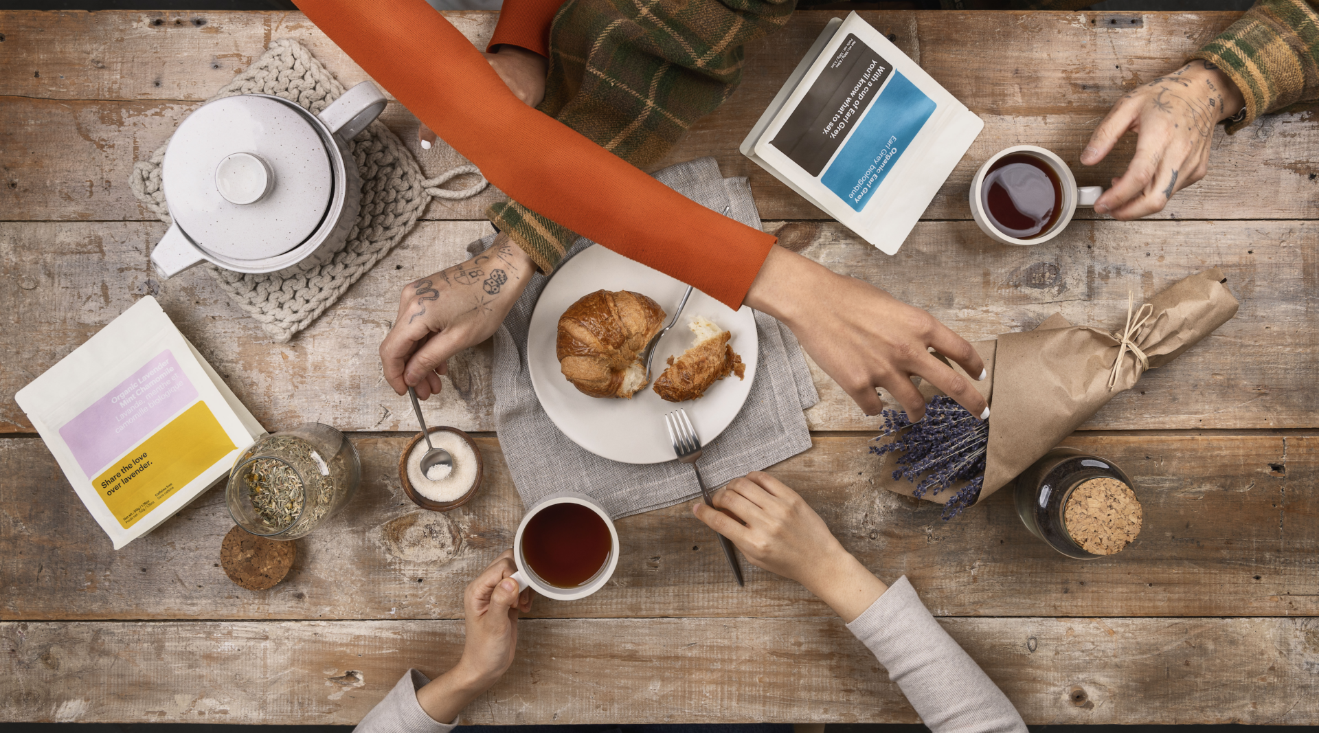
With a clearly defined (and well-researched) vision and value proposition at the heart of the brand, it feels authentic, meaningful, and consistent at every turn. And from this brand identity, we designed all of the Habit packaging and built the website, brought to life by beautiful imagery.
This photography, using the simple but impactful creative concept of hands expressing a range of emotions in conversation, gives Habit a unique and ownable art direction, and a powerful brand visual.
We’re very proud of our work with Habit. Careful research, learning, and positioning has resulted in a truly unique brand, and we couldn’t be happier with the result.