A beautiful founder story used to create branding that captures a clear purpose, while conveying quality and sophistication.
Branding, Copywriting, Graphic design, Marketing strategy, Photography, Web development
Background and challenge
H.D. Cleverdon was a branding challenge we loved taking on. Inspired by an amazing family story, their team came to us looking to establish a brand which achieved 3 key things: It conveyed the quality of their candles, it spoke to the comfort those candles provide, and it authentically told their story.
This last point was particularly important, as the entire company was inspired by the great-grandfather of the founder, even lending his name to the brand. A loving and caring man, his life meant so much to the family, and so authenticity and depth were incredibly important from the outset.
"The Fook team went beyond what would have been expected to help us brand and launch our company. We will enthusiastically continue to use and recommend them."
Ambur P – Co-Founder
Process and solution
And for us, authenticity always starts with understanding. So we listened to countless stories of who this man was, what he did for his family, and the inspiration that he gave to others. We carefully understood his life, even reading some of his letters, so we could authentically bring his character and story into the brand.
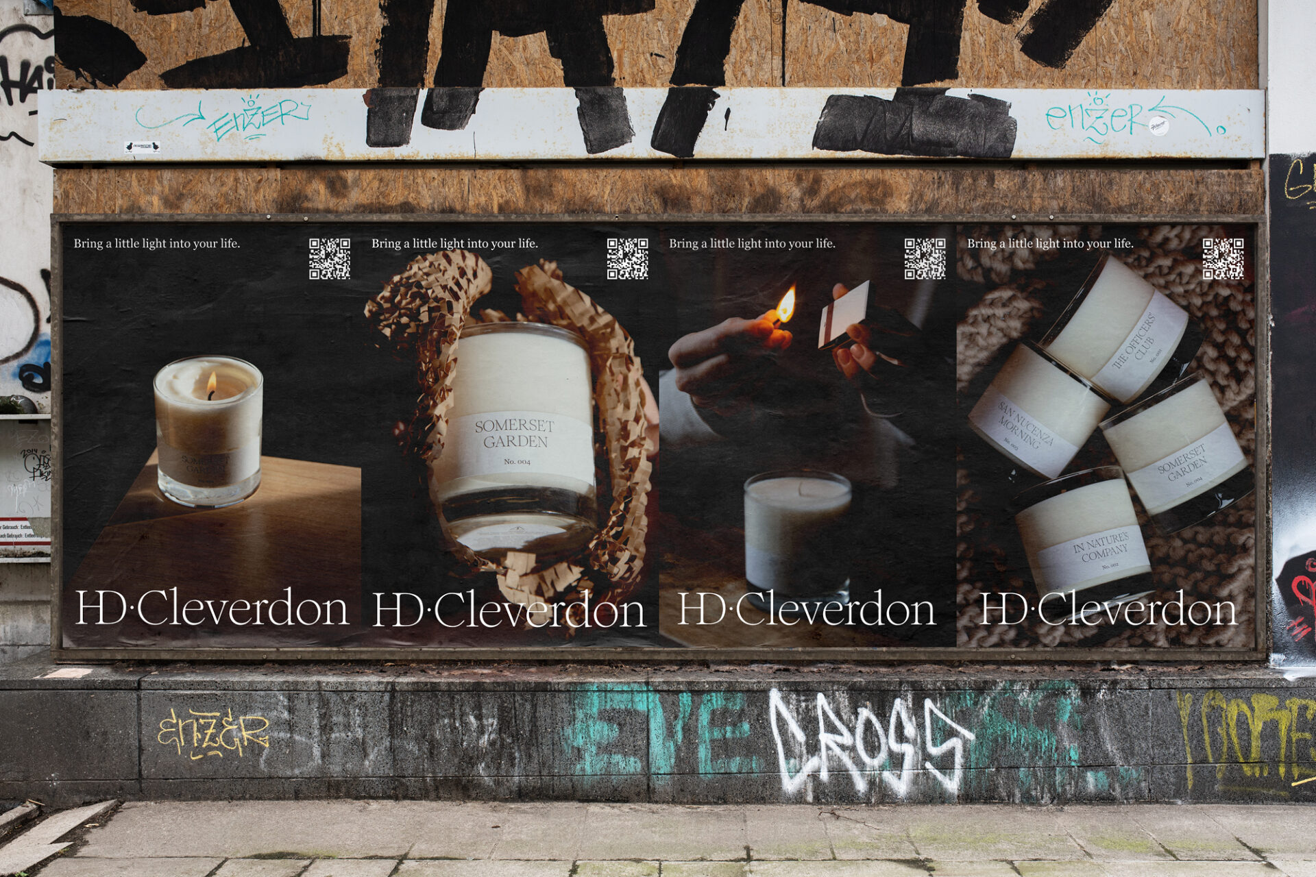
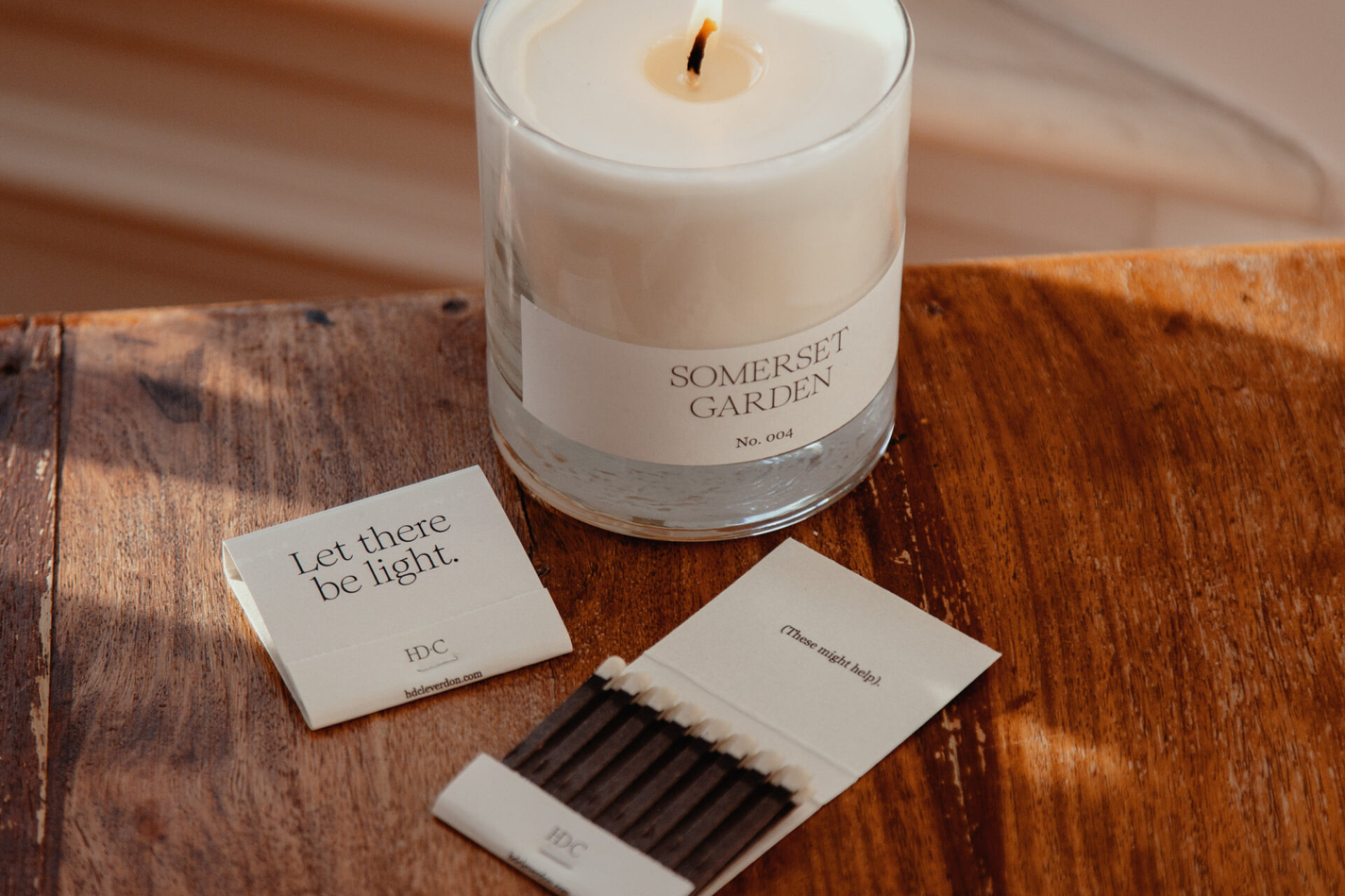
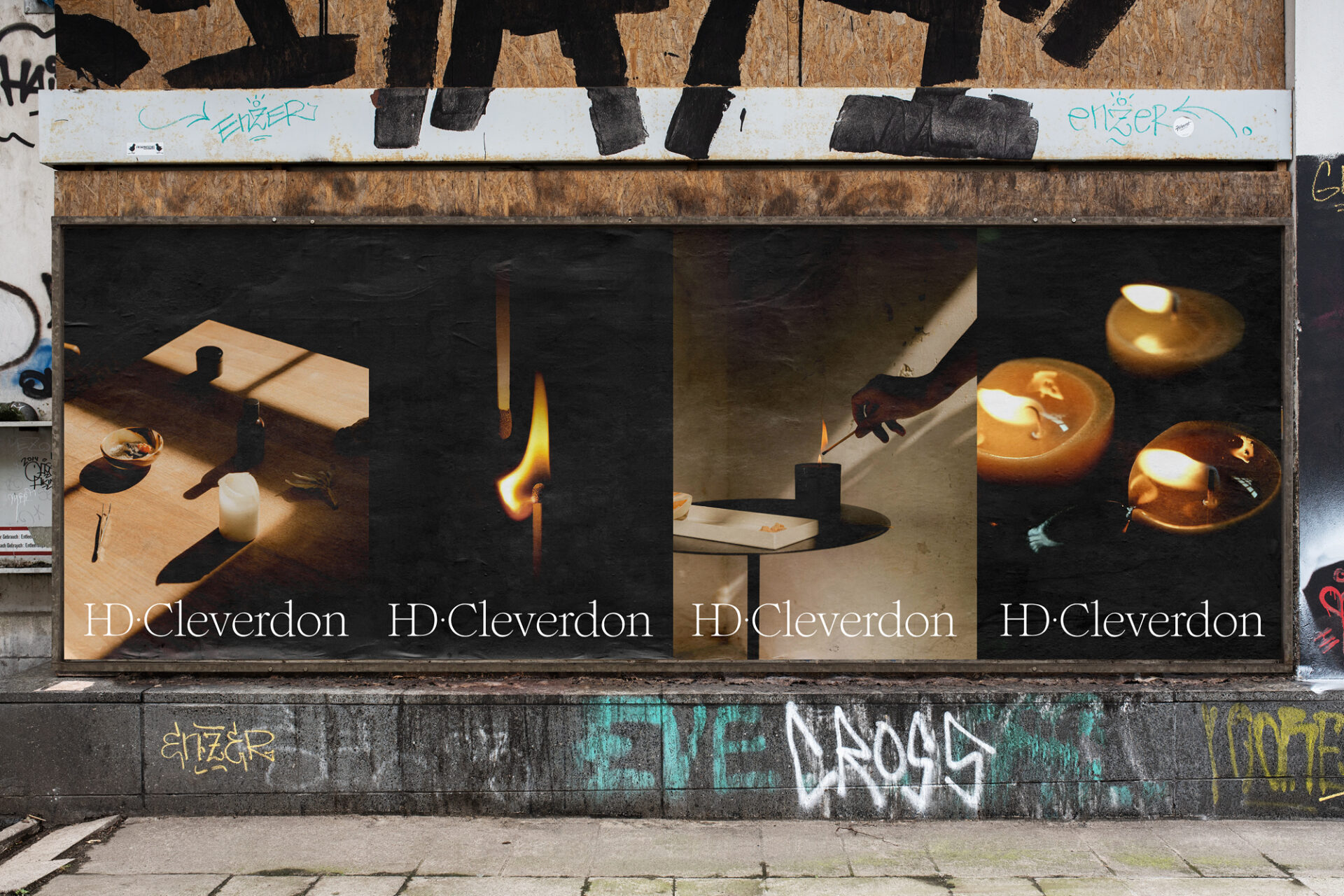
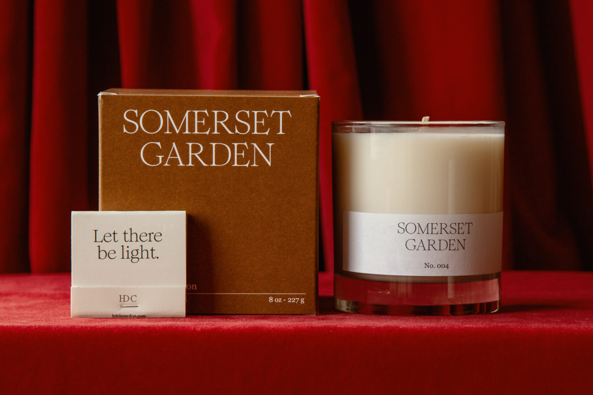
Through this process, and keeping in mind the 3 key goals set at the start, the logo was created. A simple, clear, and honest presentation of the name, we have a mark that conveys a sense of calm and peace. Set in the Romie typeface, the logo allows H.D. Cleverdon to stand with confidence and elegance, while remaining approachable. It communicates the craft that goes into their work, bringing associations of quality and distinction, without losing its warmth.
In the colours, the primary tones are black, brown, red, and white. These colours are deeply tied to H.D. Cleverdon himself. He served as a padre in WWII, and so his Bible was always at his side. The browns and reds in the colour palette, therefore, take inspiration from the tactility and familiarity of how we might picture a traditional Bible.
The colours are also intentionally calming to reflect the moments of contemplation and peace that people will have when sitting with a candle.
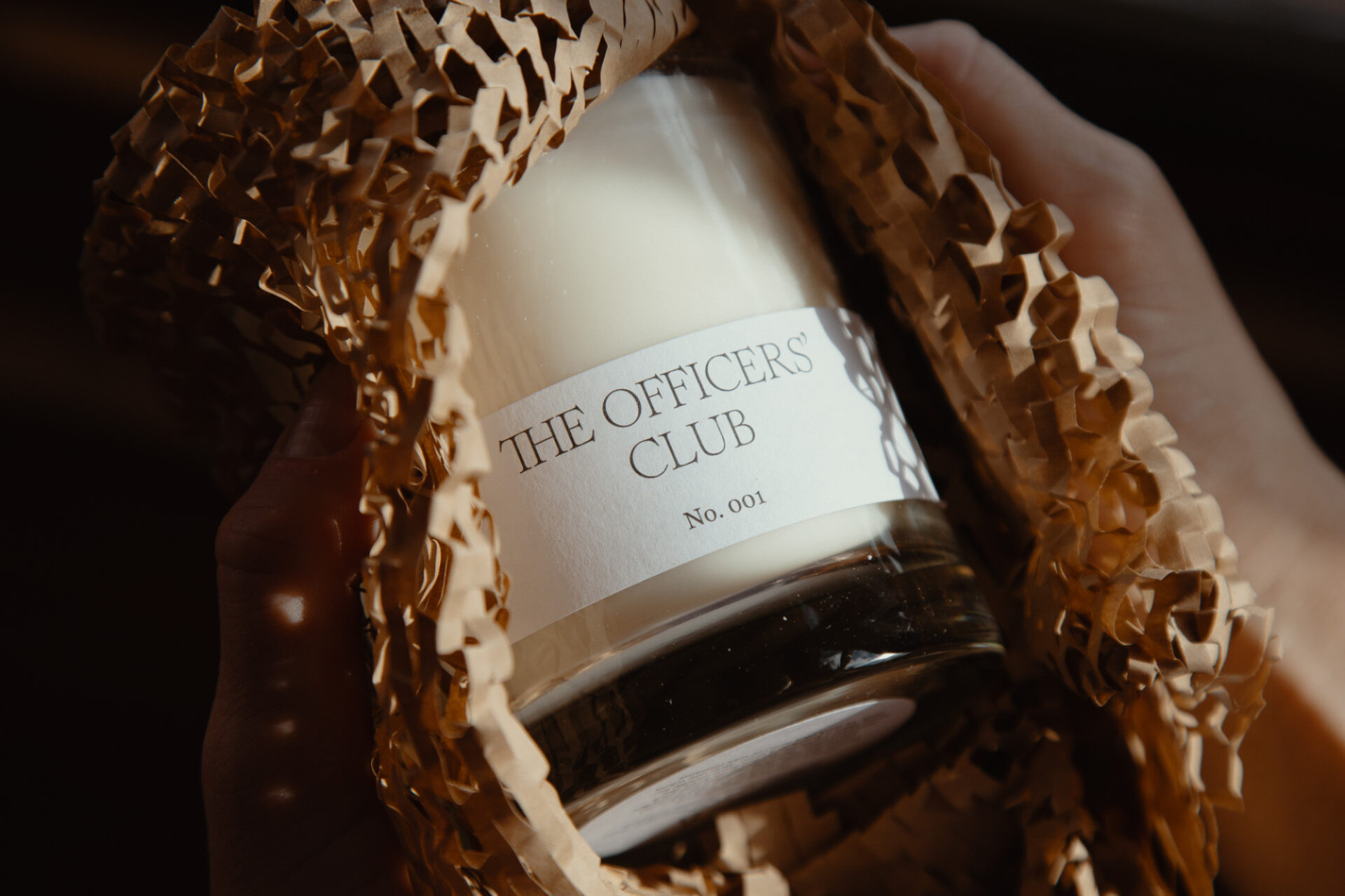
In terms of brand voice, the same inspirations were taken from Mr. Cleverdon. Reflecting his character also meant borrowing some of his wit and warmth for the language we used. Even the product names themselves came from us poring over letters he sent to loved ones from the front lines, searching for words and phrases that allowed us to build a naming convention with real meaning.
Result
What resulted from our process is a brand with real substance, personality, and a clear voice. Not only does it position H.D. Cleverdon as a maker of the highest quality candles, but it feels sincere and is a true reflection of the brand story.
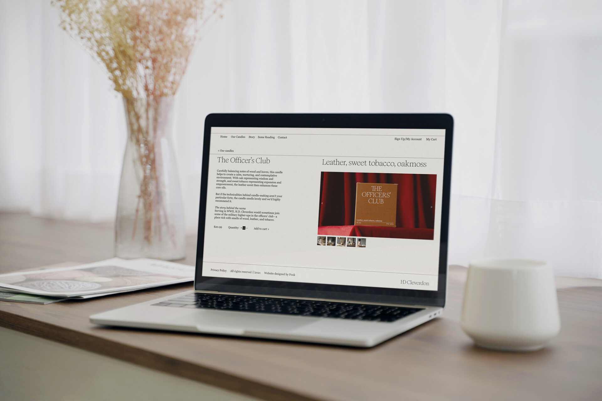
With that branding now in place, and a beautifully consistent brand experience established (from the online store to the shipping packaging), we are now working with H.D. Cleverdon on a social media strategy to drive traffic to their ecommerce store, focusing on high quality photo and video content to grow their following and brand awareness.