Inspired by the lifestyle in its Canadian hometown and fashion-forward activewear, Seasonal Resident’s branding perfectly targets its demographic.
Branding, Copywriting, Graphic design
Background and challenge
Seasonal Resident is a fashion and activewear brand based out of Muskoka, Ontario. Offering clothing inspired by the lifestyle that surrounds them, they needed a brand identity that was distinctly Muskokan, while also positioning them at the cutting edge of fashion.
Following the rapid success of their luxury sister store, Cou (also branded by Fook), the team behind Seasonal Resident quickly followed up with an offering tailored to an altogether different market. Our work with Cou established a visual identity designed to hold its own among high-end, exclusive fashion brands. However, this time we were talking to a more casual audience, but one that was still fashion-forward.
So a key challenge here was creating an identity that could support a brand commanding a premium price tag, without being too elevated, taking itself too seriously, or leaning too far into a luxury fashion angle.
And so, at the centre of this project was the demographic of people who inspired the company’s inception. The name itself, ‘Seasonal Resident’, is a reference to Canadian urbanites who frequent the countryside for vacations and getaways, coming to Muskoka to find fun and adventure. These young visitors want to dress to be active, but with the style of the city.
Process and solution
The logo, therefore, was designed to convey light-heartedness and a little fun. A simple typesetting of the company name in the Grenette typeface, the logo doesn’t take itself too seriously. However, with its open arms and robust letters, it balances this fun and approachability with sophistication and confidence.
The asymmetry of the typeface gives it personality, while maintaining the impression of careful construction. These characteristics were the ideal reflection of the Seasonal Resident offering: casual clothing, with a commitment to design and quality.
Grenette was then supported with Graphik as a secondary typeface, used to clearly communicate details and information without stealing the show from Grenette. It’s clarity and neutrality made it the perfect partner for a primary typeface that is bold and has a few quirks.
Black and white were chosen as the brand’s primary colours, and the secondary palette was left deliberately open to cover any and all shades. This dynamic use of colour continues the theme of the vibrancy of life in Muskoka, but also gives the brand the ability to adapt to their constantly shifting clothing collection, and to adapt with the seasons that run so centrally to the company. As the changing seasons are one of the main motivations for people to visit Muskoka, it made sense to fully embrace them in the brand identity.
Result
The visual identity we created has helped the Seasonal Resident brand to flourish, with the company both running a successful store in Ontario, and also launching their own line of clothing.
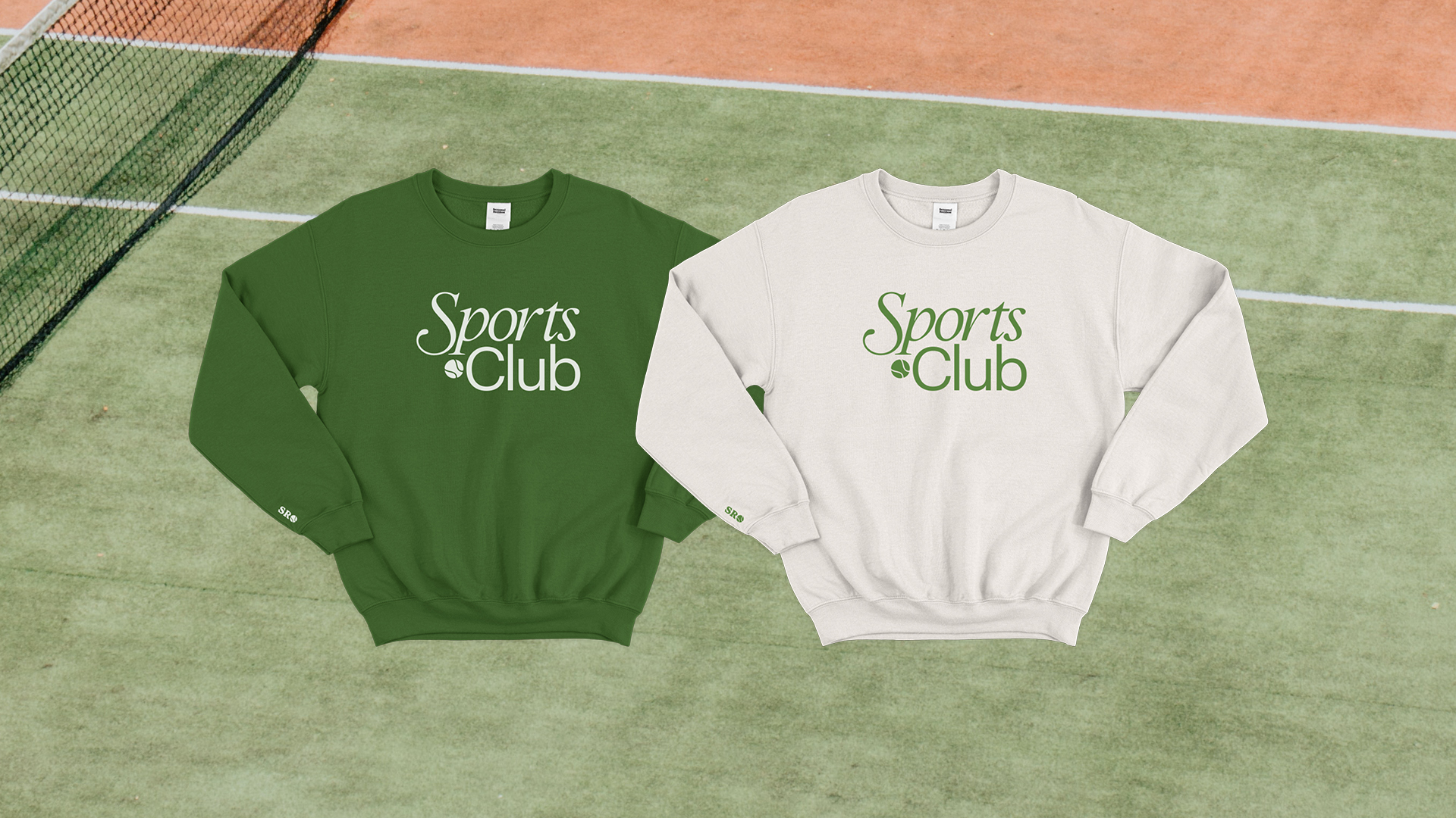
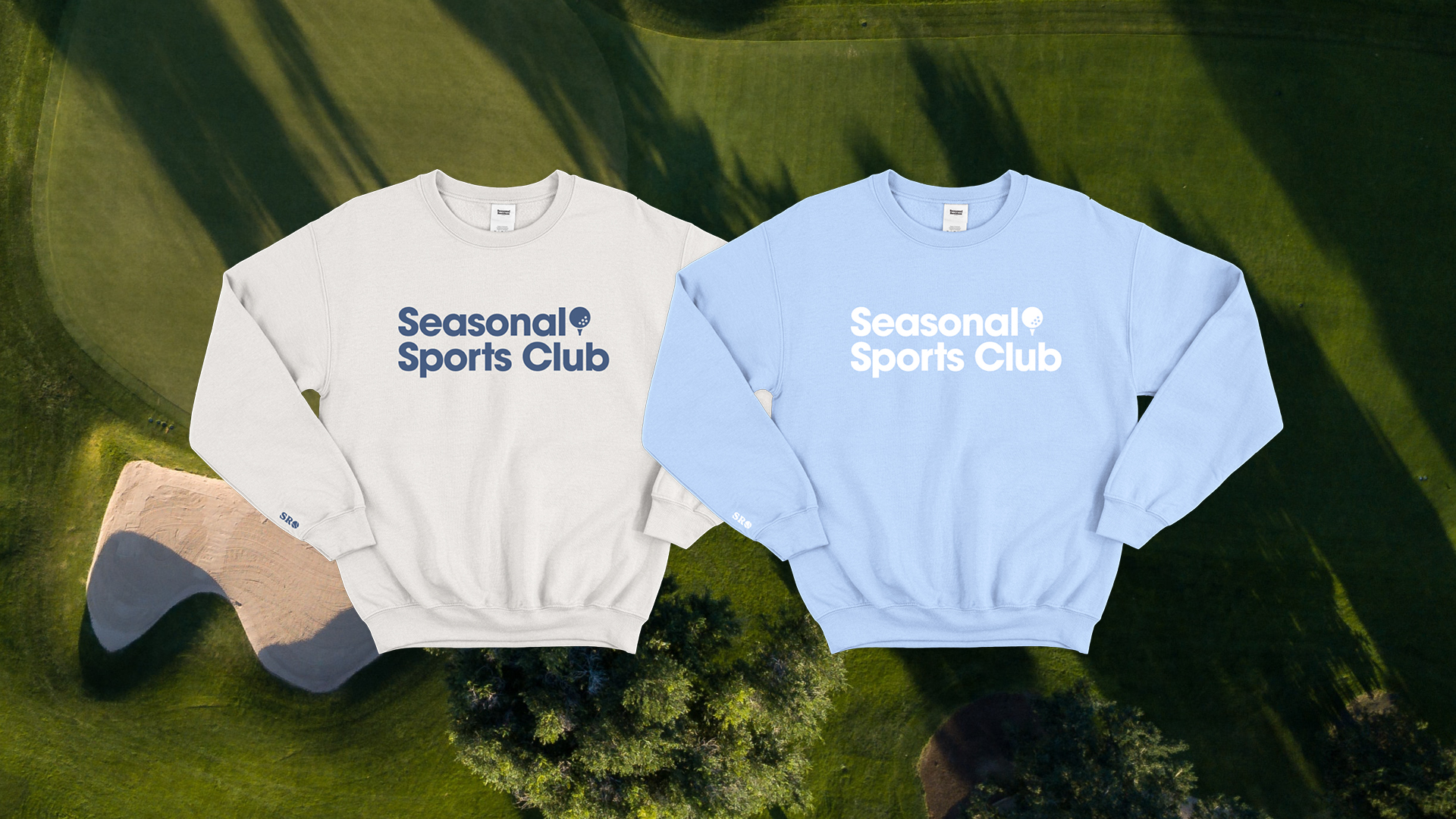
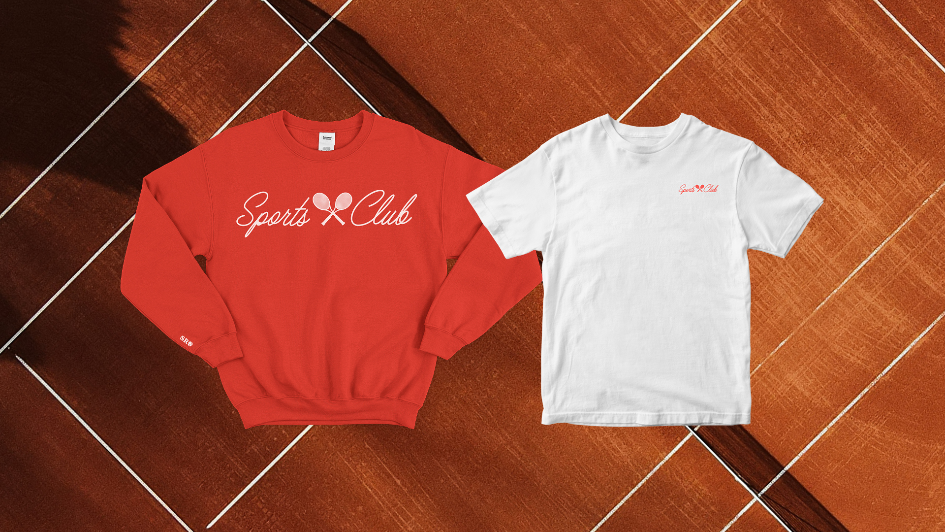
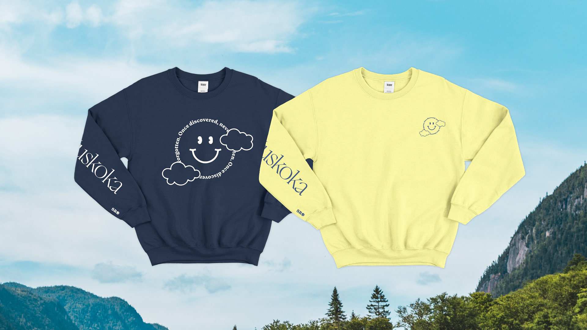
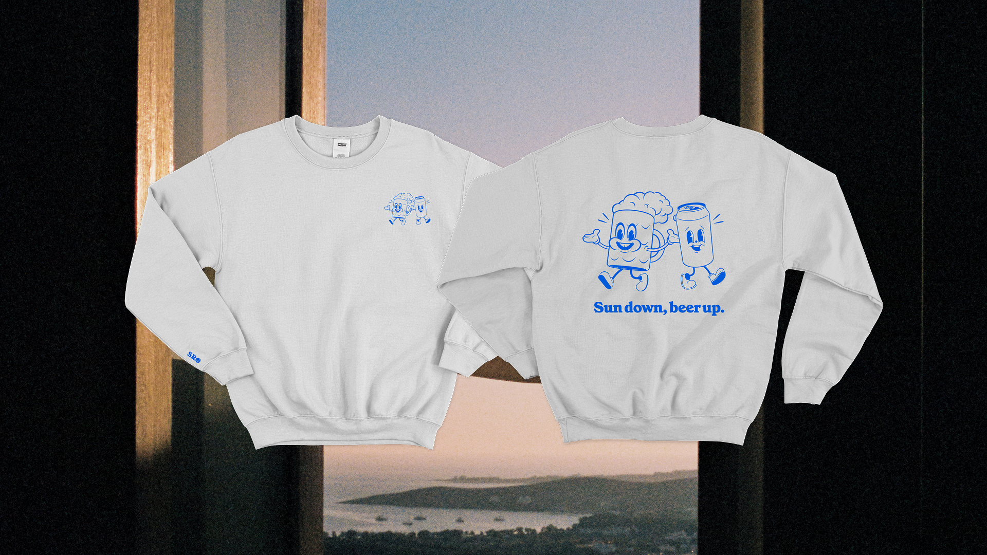
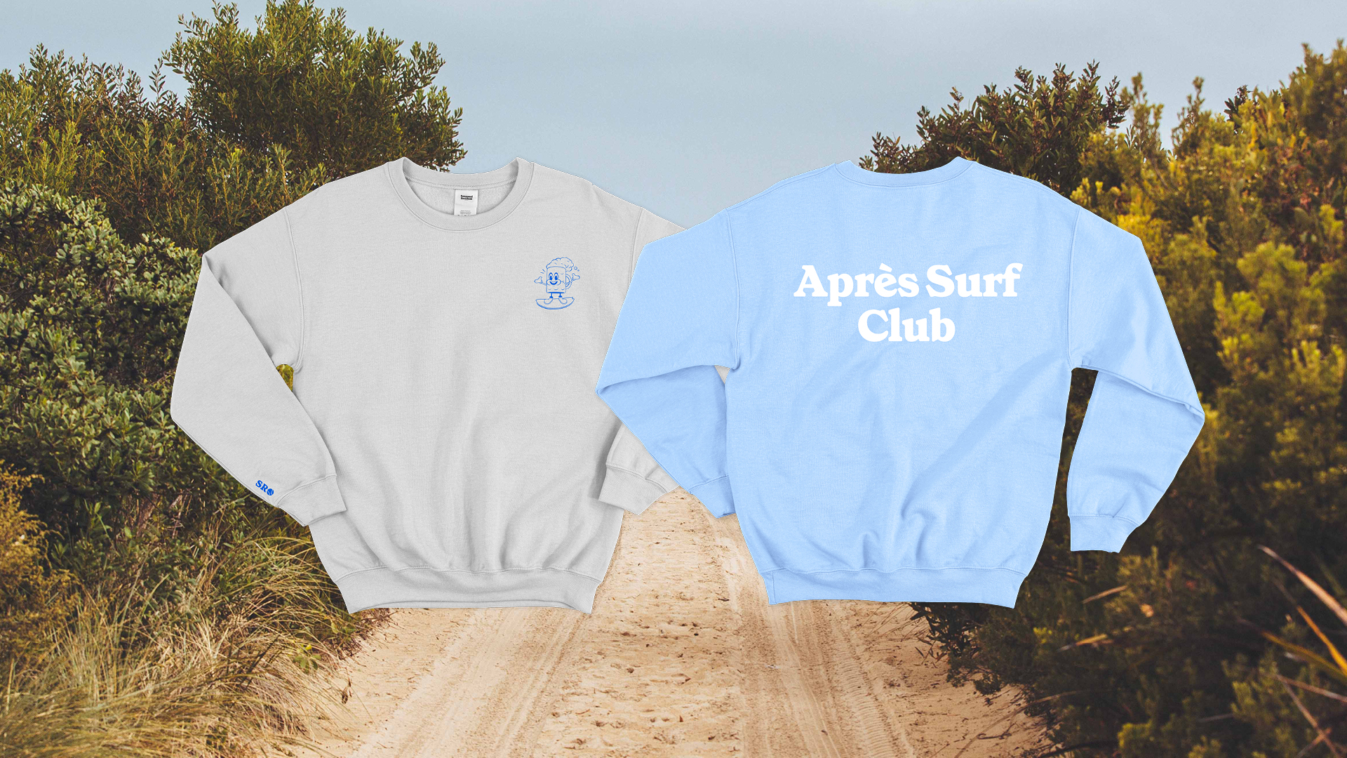
With the brand quickly finding its feet after its doors opened, we collaborated with them to create a line-up of sweaters, pants, bags, and t-shirts that captures the essence of Seasonal Resident, the lifestyle it represents, and the design quality of its clothing.
By carefully understanding the target audience and the vision for the brand, we shaped an identity that resonated. Seasonal Resident is steadily growing an engaged and loyal following among its demographic, and expanding its own product offering into new categories.